P.S. Keep in mind that when she mentions that somewhere is walking distance, it can be an hour and a half walk.
P.P.S. When she is not walking and (try to) not thinking—subway ride as an example—she must be playing NYT Crossword, Spelling Bee, Wordle, and Sudoku on her phone.

Advana - Marketing Website
Role: Visual Specialist, Designer
Skills: Visual Direction, Visual Design, Layout Design, Typography, UI Design, Illustration
Collaborated with
Hayley Lyle (Elyon Technologies)
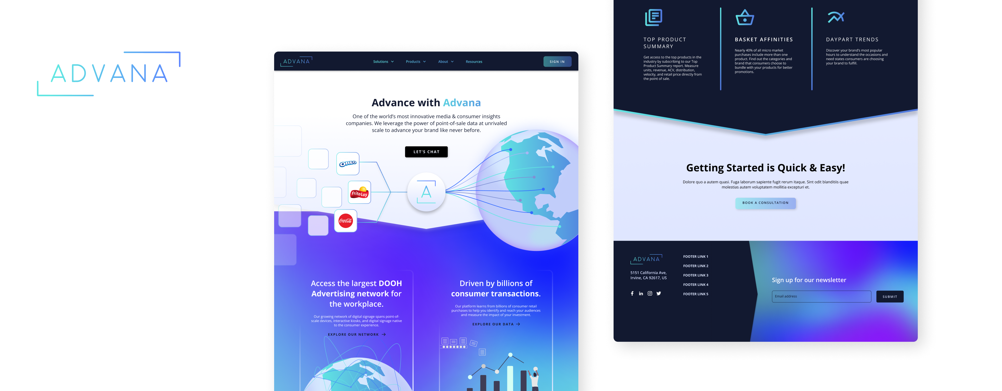
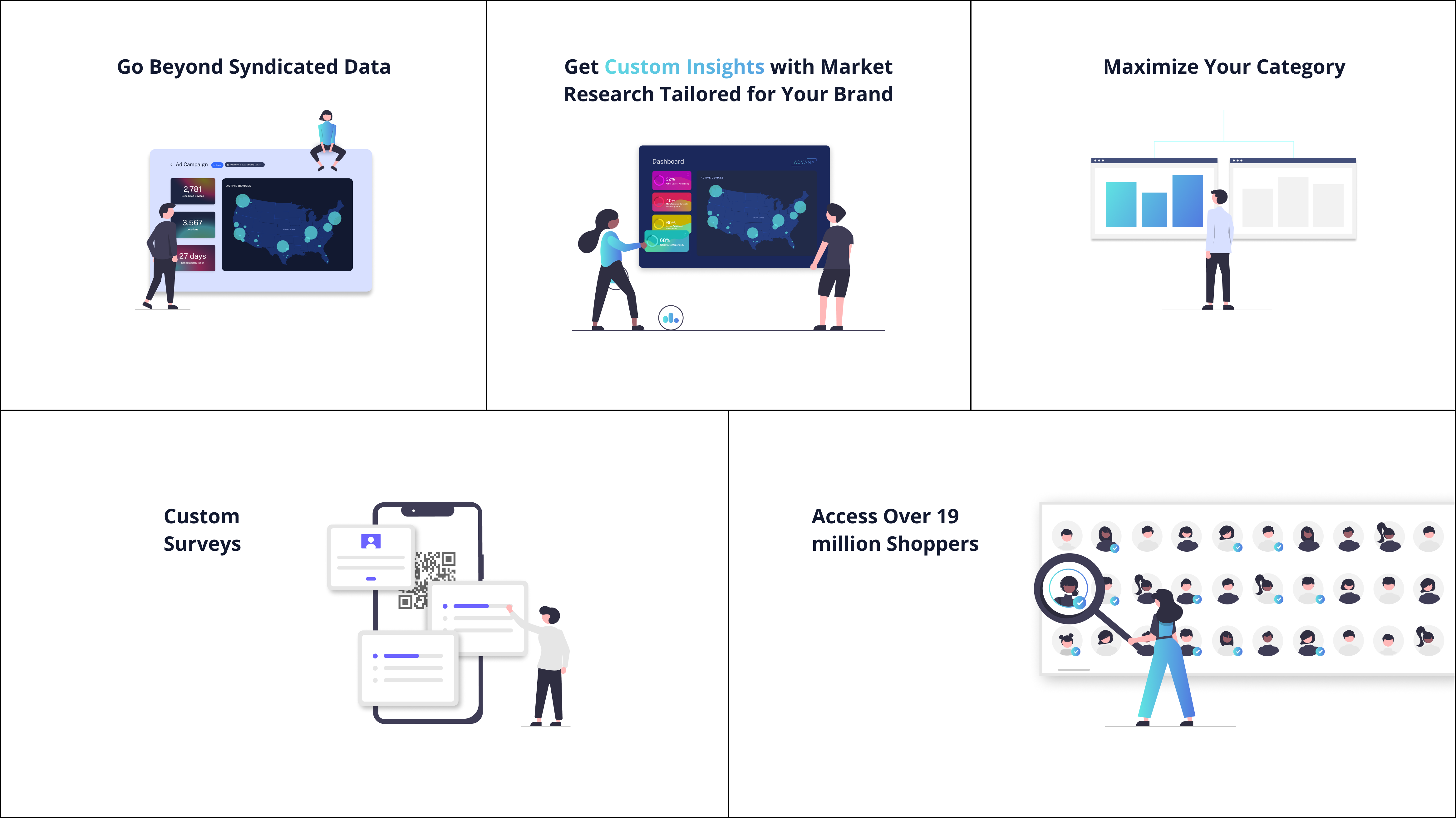
Advana is a leading platform that offers brands and retailers unparalleled audience targeting capabilities, leveraging real point-of-sale data to provide accurate and measurable results. With a specialization in Digital-Out-Of-Home Advertising, Shopper Promotion, Syndicated Data, and Market Research & Insights, Advana delivers comprehensive solutions to drive success in the fast-paced market landscape. The essence of Advana's commitment to delivering in-depth insights and data-driven solutions is beautifully encapsulated in their logo, which represents their dedication to thorough research and immersive data analysis.
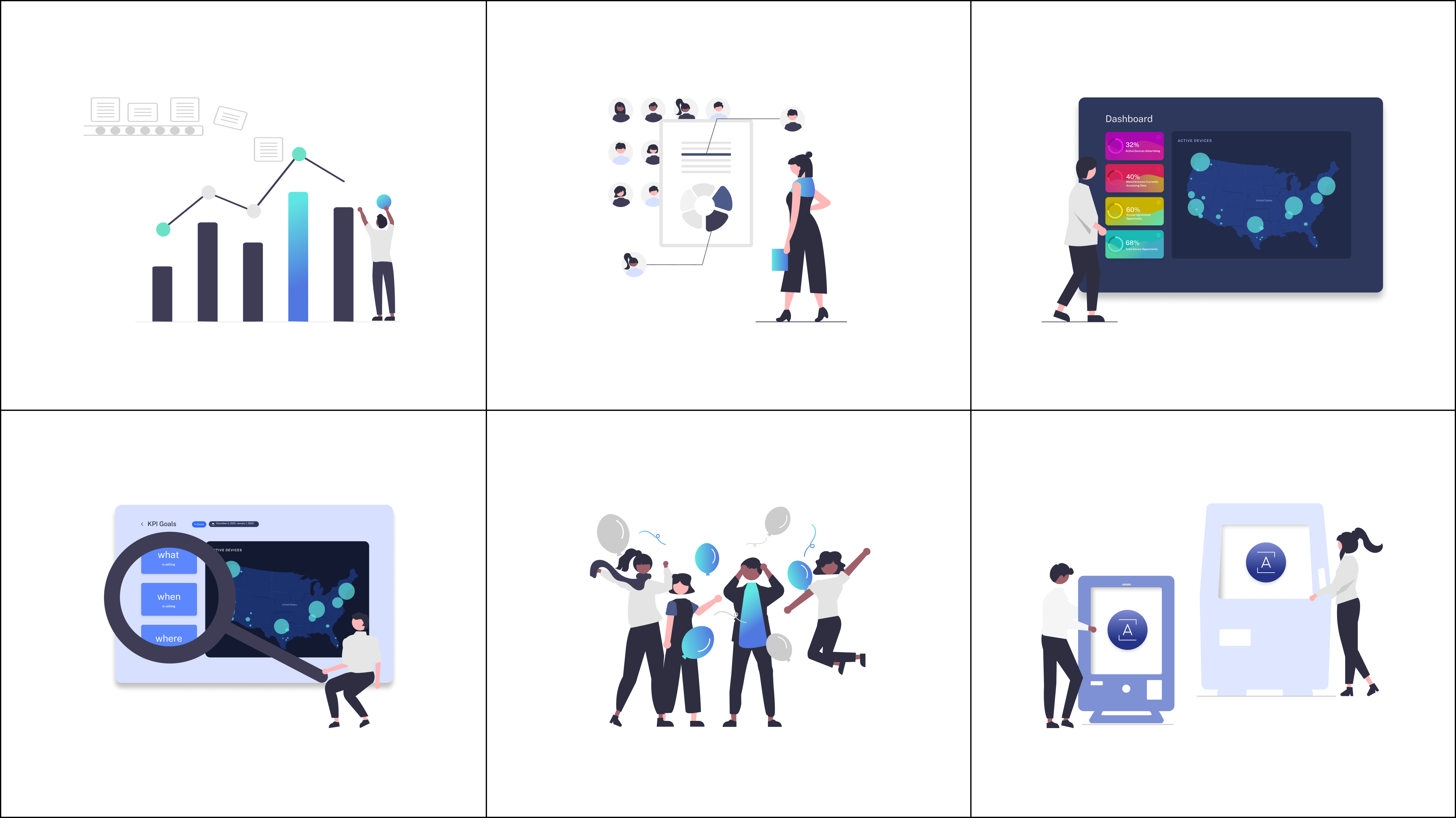
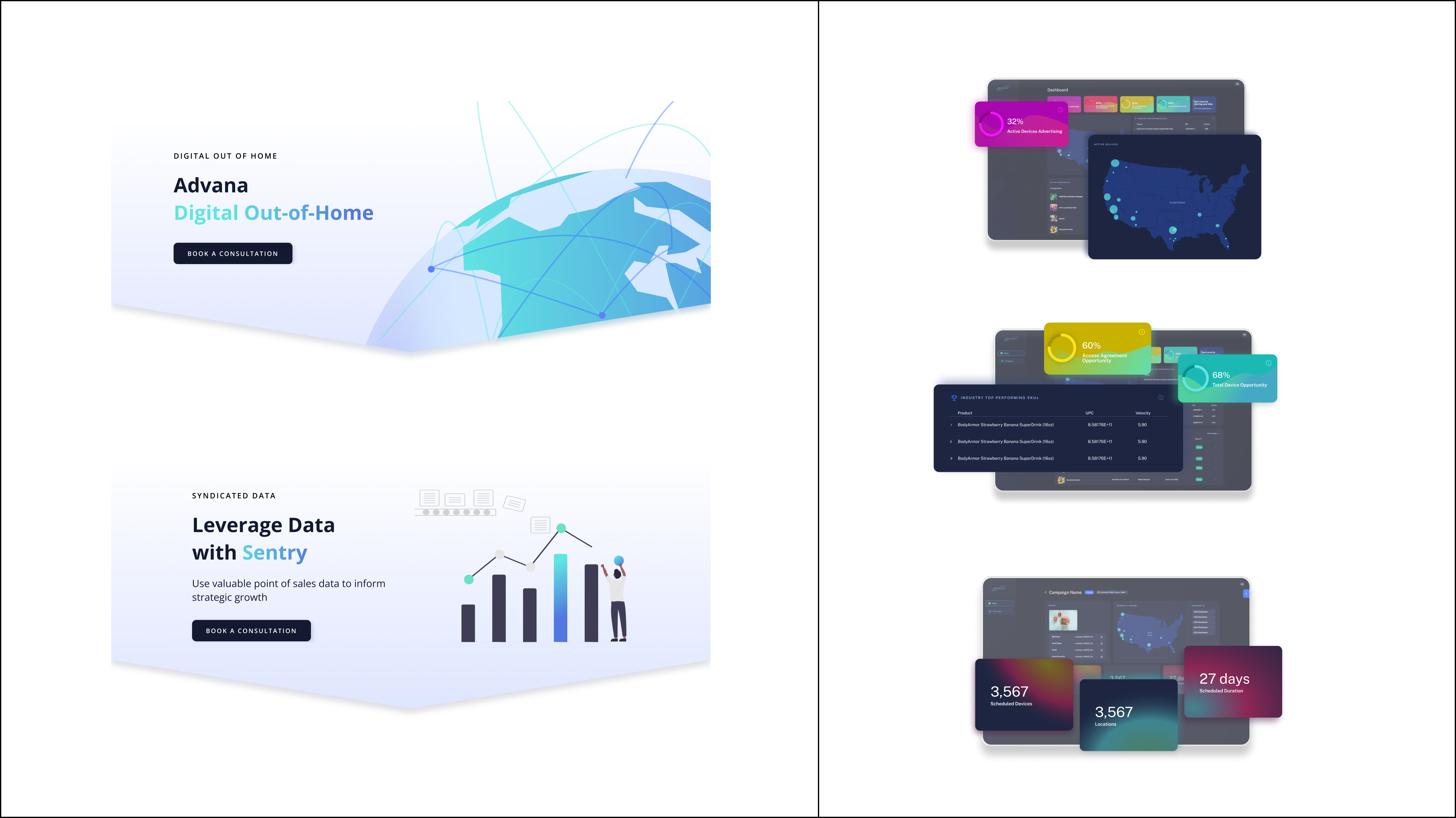
Recognizing the pivotal role of a marketing website as the face of the brand, I have meticulously developed new visual elements that enhance the vibrance and composition, all while staying true to Advana's distinct color palette and visual language that reflects its identity.
Old Marketing Website
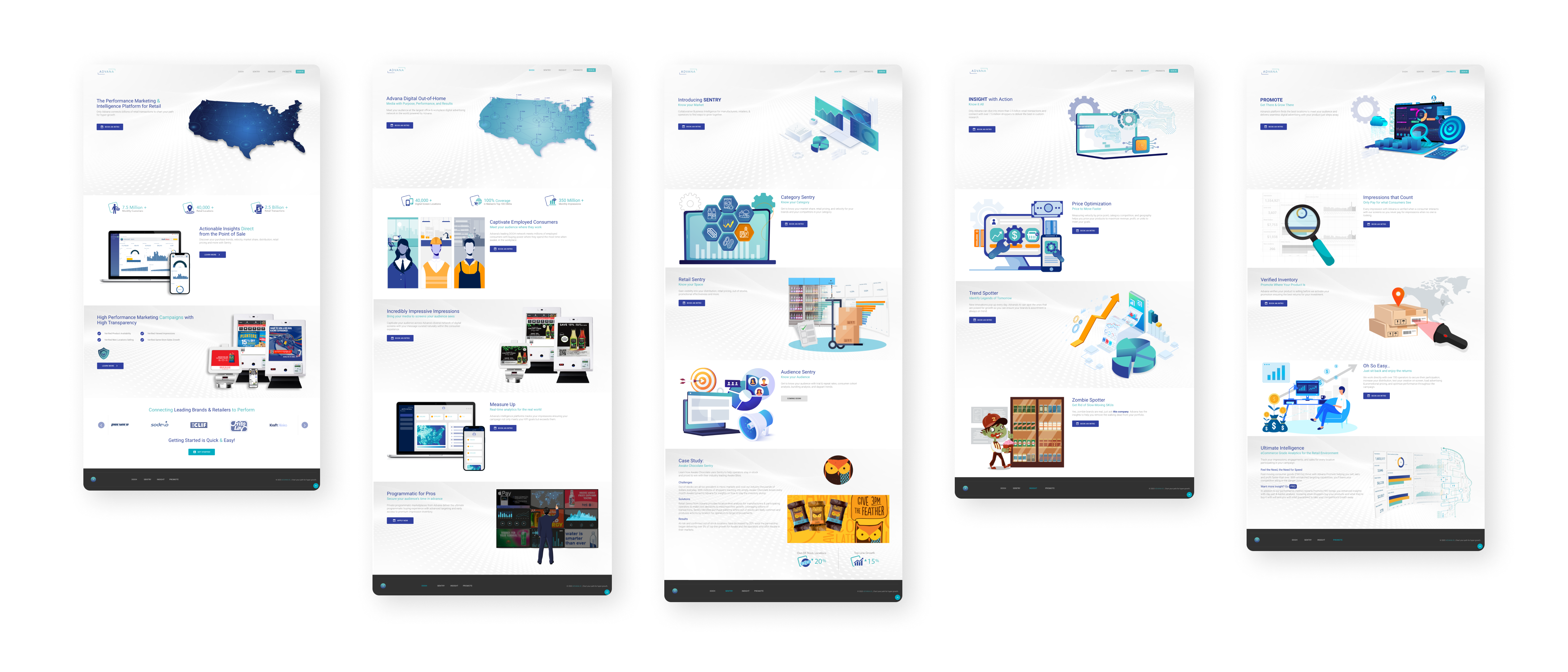
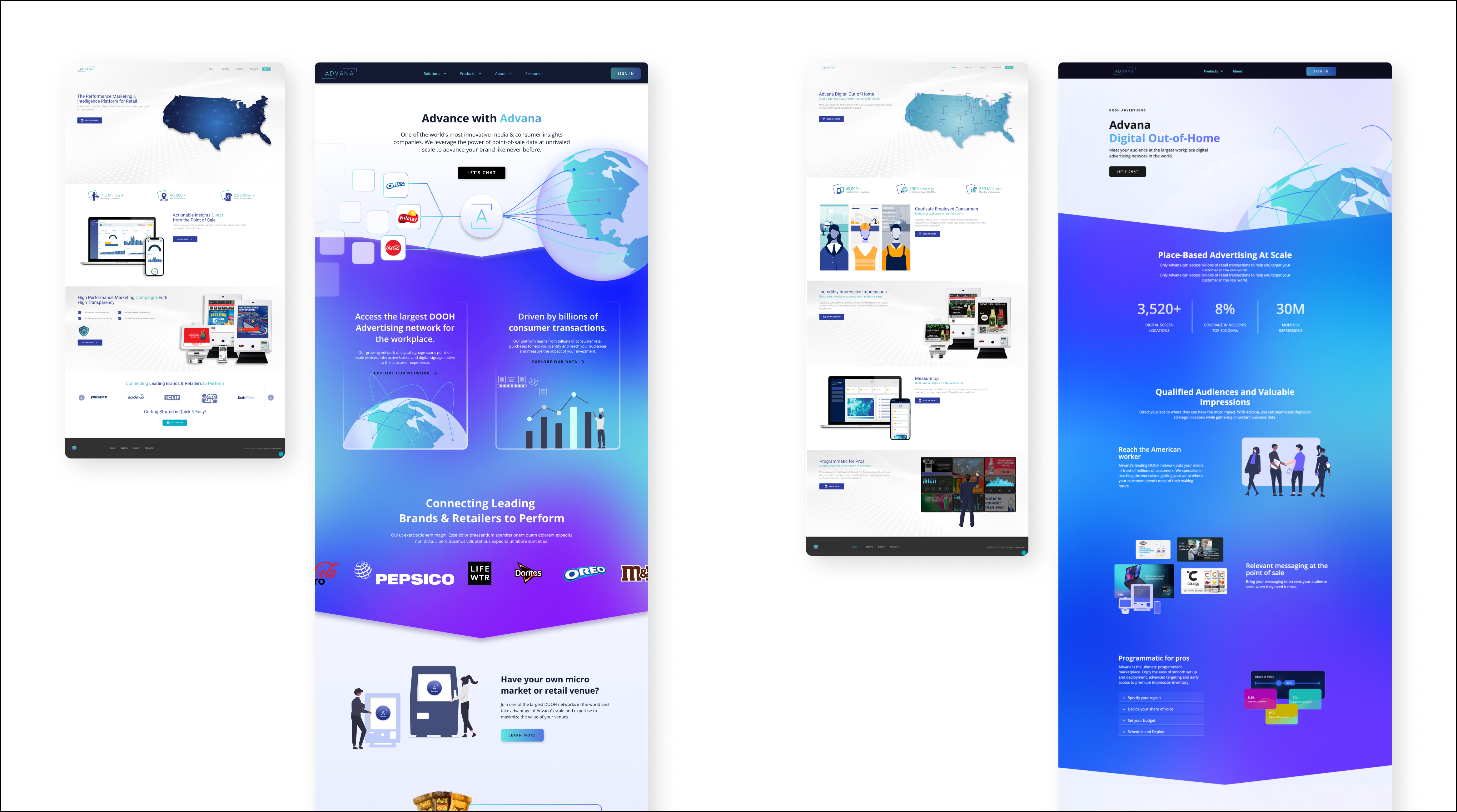
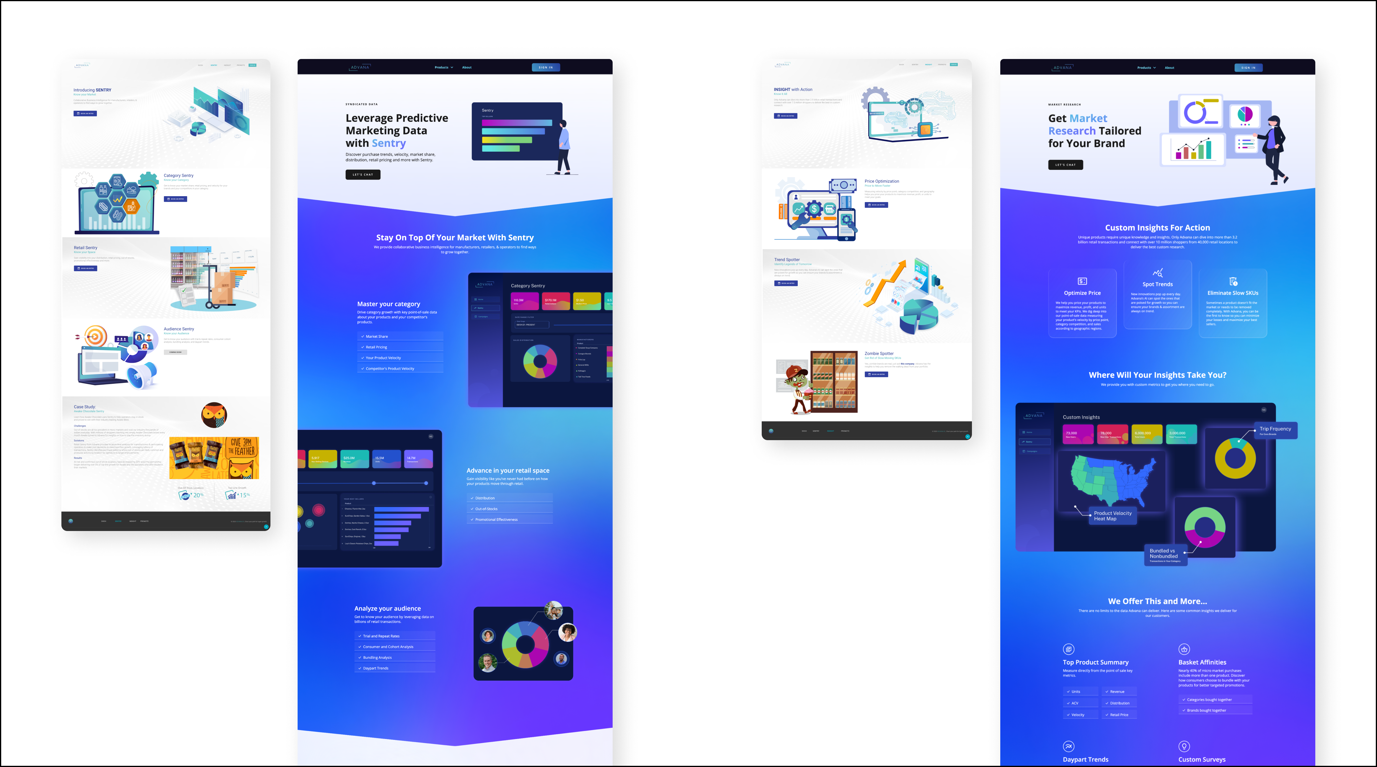
The previous version of the website had a dull color scheme and rigid sections, lacking a cohesive visual language. To address this, my focus was on creating a vibrant and cohesive visual language that would make the website eye-catching and enticing to scroll through for more information about Advana. I'm pleased to share the new visual elements and the updated Advana's marketing website, which can be viewed live at advana.io.
Updated Marketing Website
Illustrations

Botari App
Role: Design Director/Consultant
Skills: UX Design, Visual Design, Prototyping
Collaborated with
Jihee Jeon
Cebin Jung
San Kim
MyungAh Song
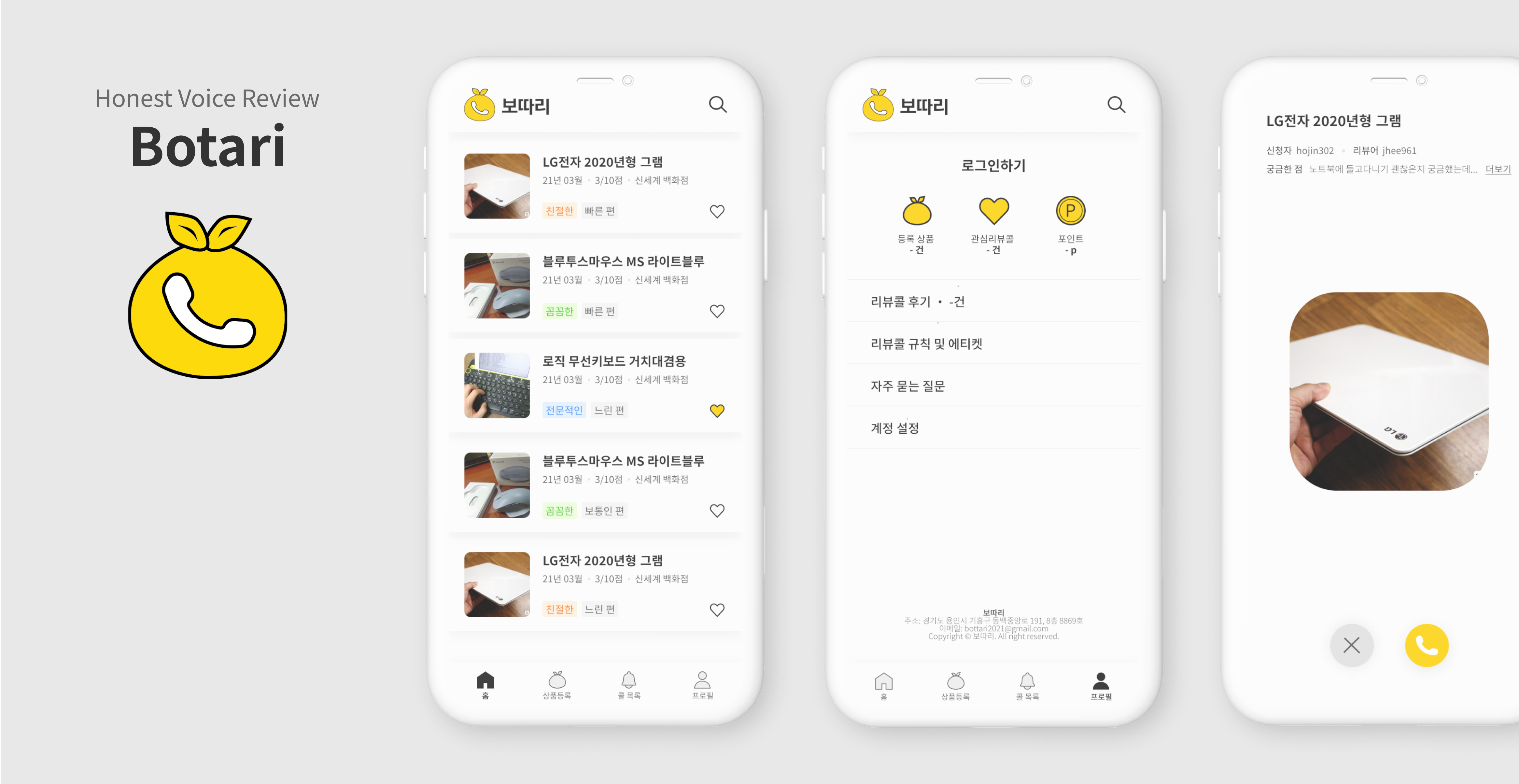
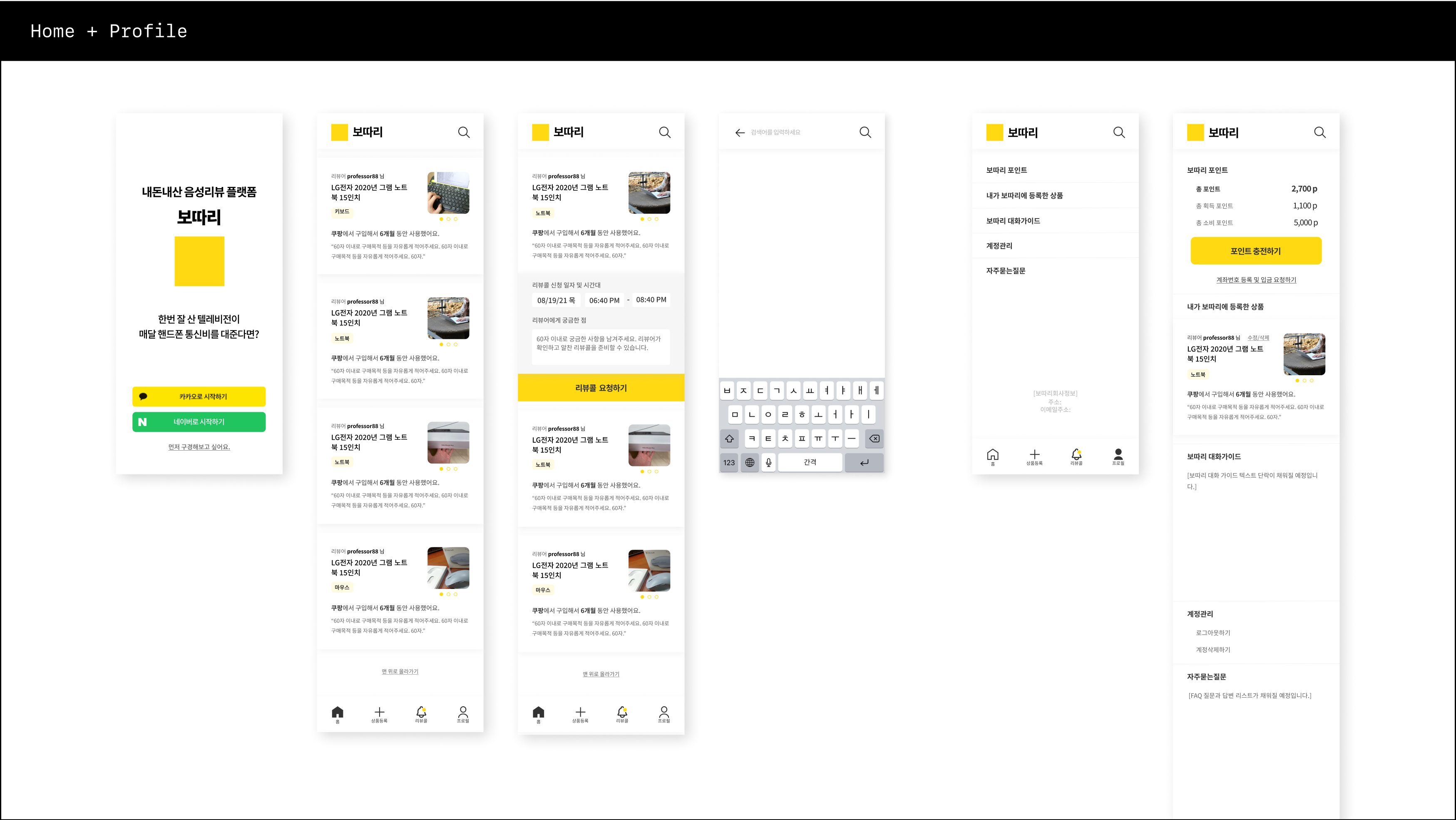
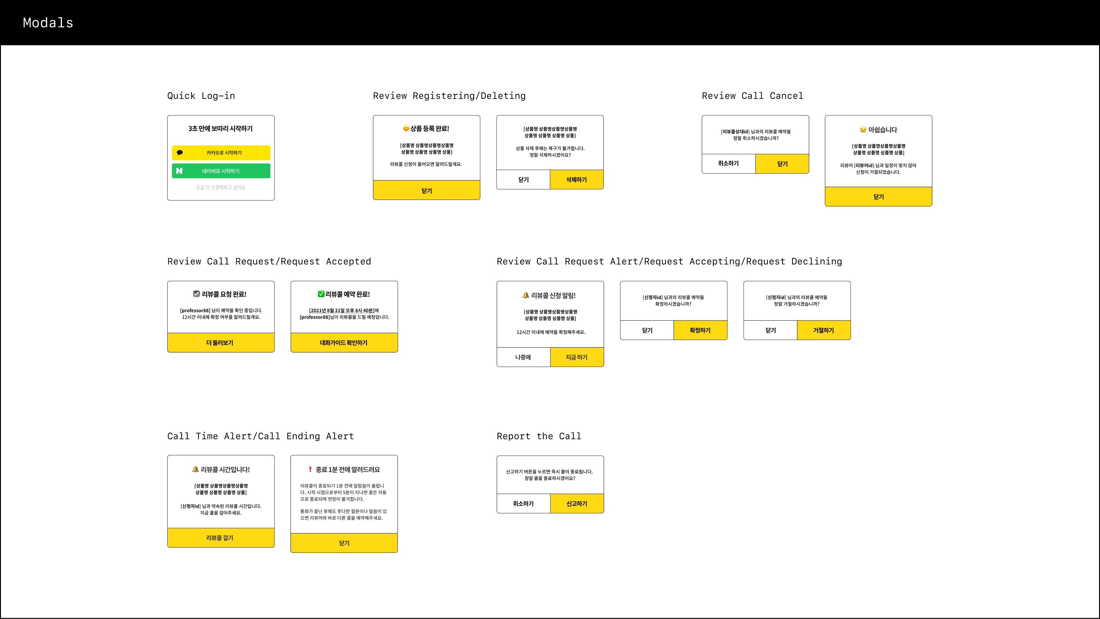
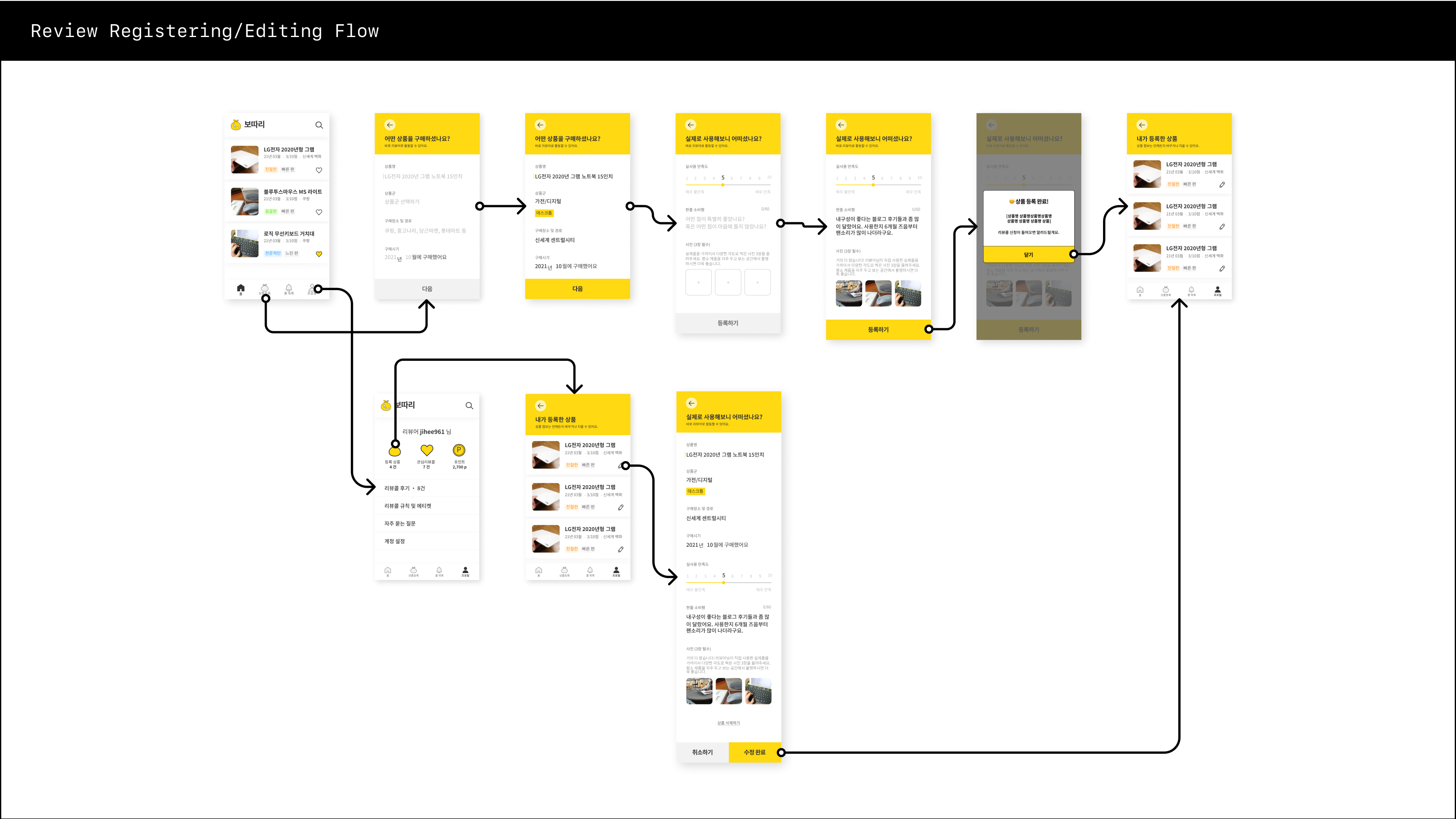
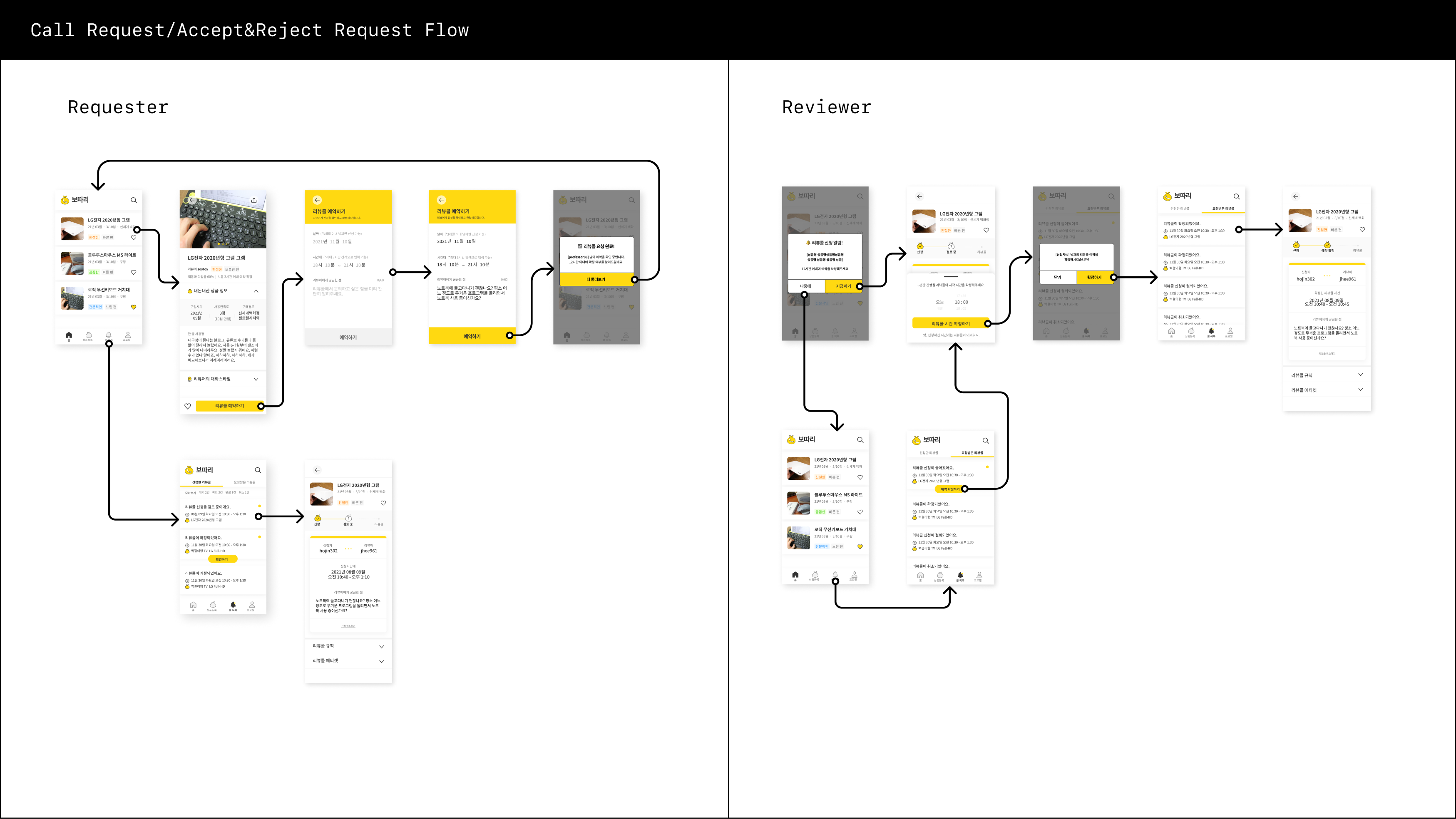
Botari is an app that people share their reviews via voice calls. Our team developed this service based on people’s interest in reward apps that provide side income to the users and economic trend of smart shopping that requires a lot of time and effort in research. Overall, the app provides a platform for users to share their opinions on products and helps other users make informed purchasing decisions while incentivizing them with rewards for their contributions.
The written reviews include general information about the product or service and more in depth reviews happen during the 5 min voice call. The voice call feature allows users to provide more detailed and nuanced feedback, and can be useful for particular questions and honest opinions about products that require more explanation or context.
Our business is using Bundling model. Users buy points which is the currency for in-app transactions. The price of each review call is based on the price of the product that is being reviewed. Review providers earn points minus 10% fee and extra tips from review receivers.
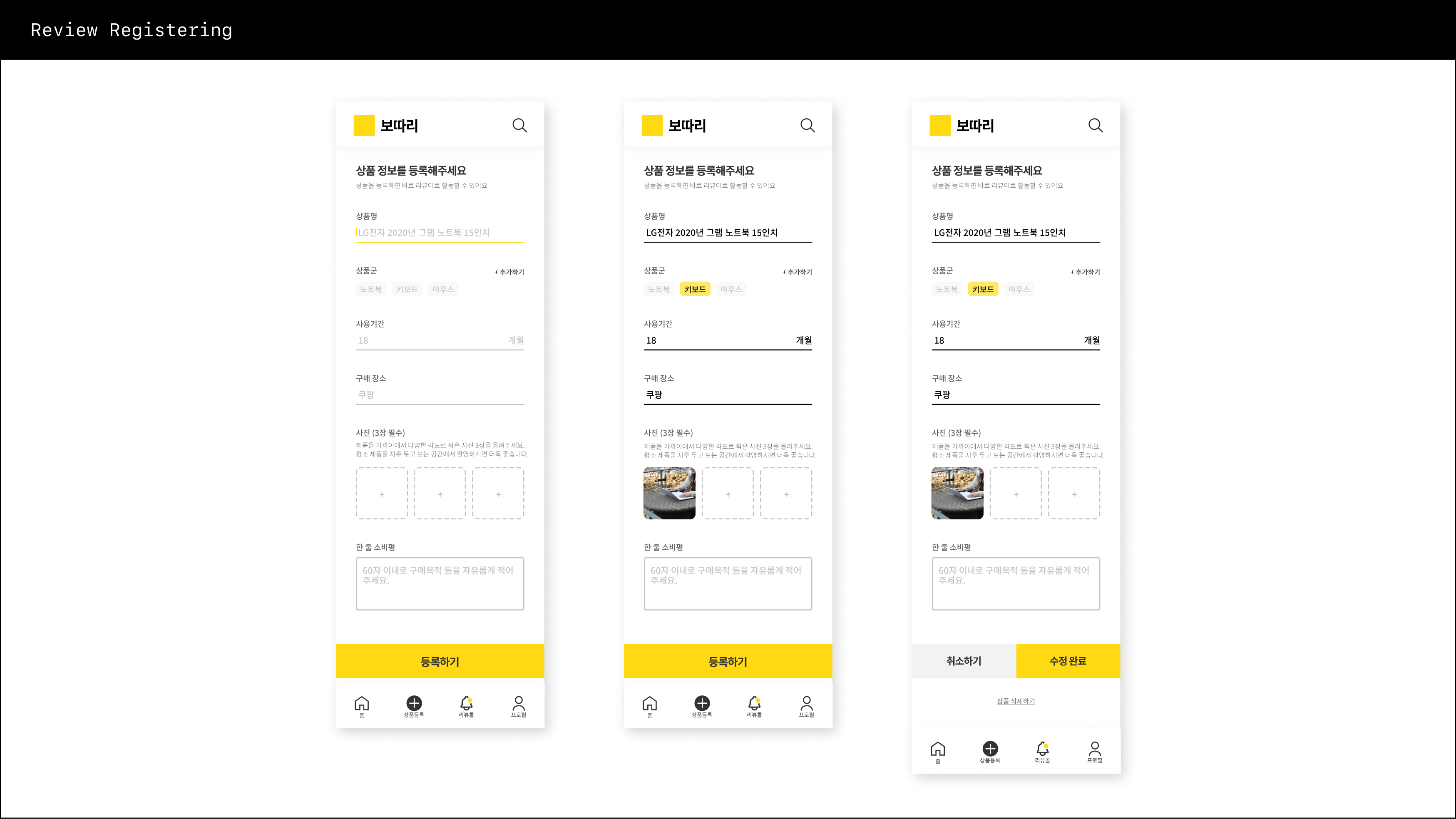
Our team consists of designers, strategists, developers, and marketers. Throughout the initial product development process, I played an active role in conceptualizing ideas, determining a feasible business model, defining the visual direction, creating user journeys, optimizing UX, crafting wireframes, and producing prototypes.
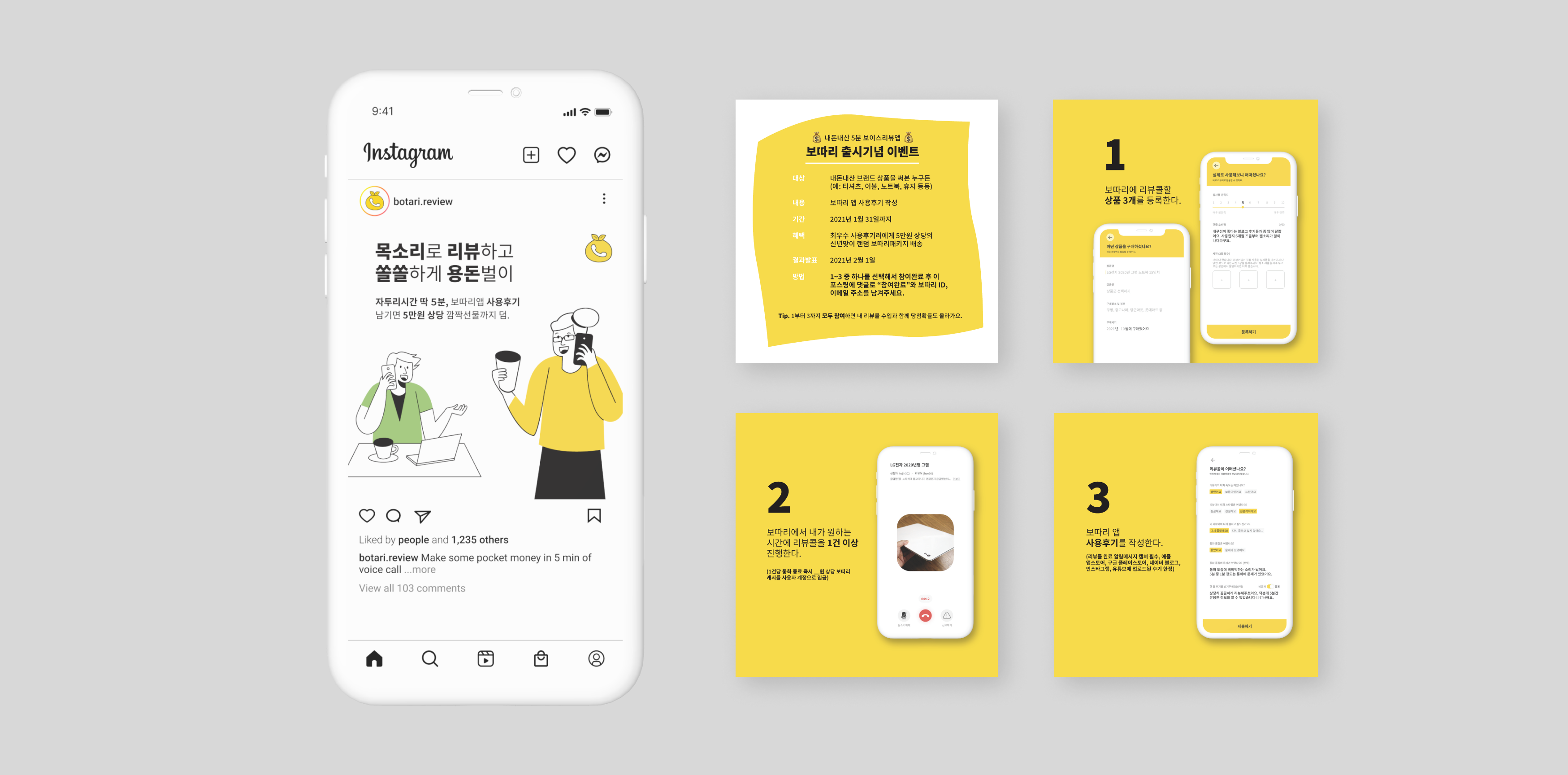
Check out our app on Instagram and App Store.
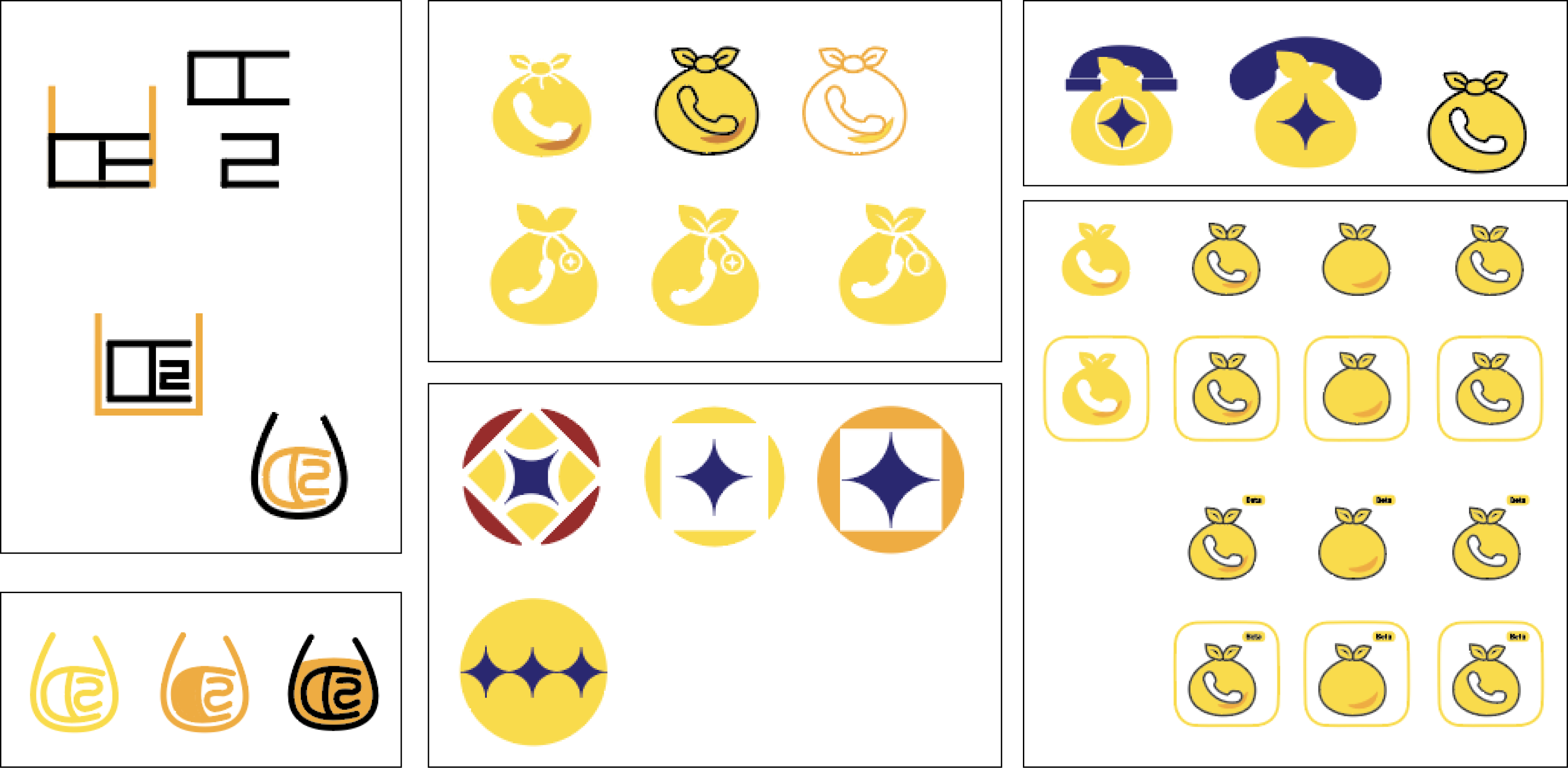
Initial Logo Sketches
Marketing Posts
Selected Wireframes & Screens
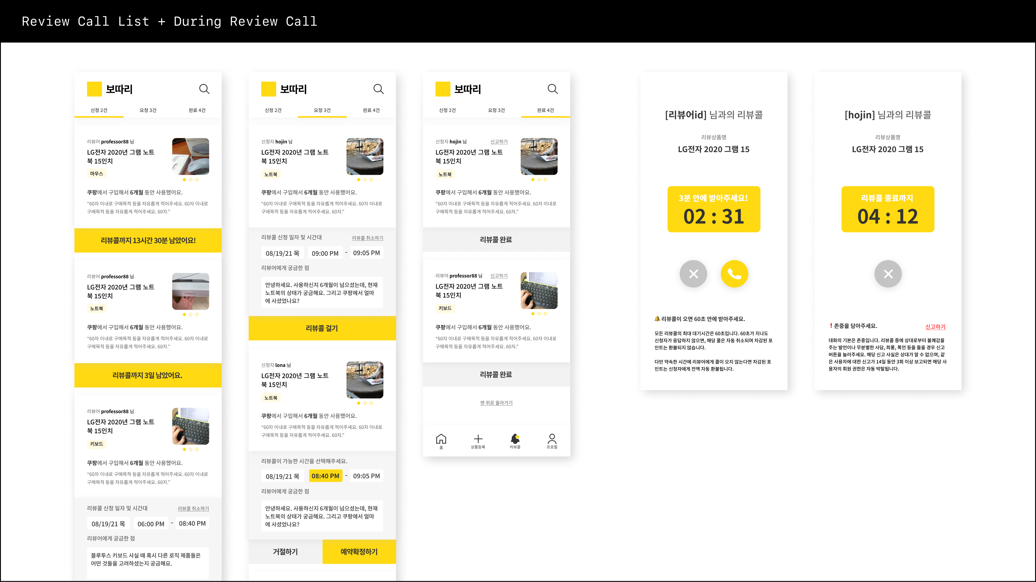
Selected User Flow

PEX Card - Digital Product
Role: UX Designer
Skills: UX Research, User Testing, UX/UI Design, Prototyping, UX/UI QA, Marketing Design
Collaborated with
The Gradient
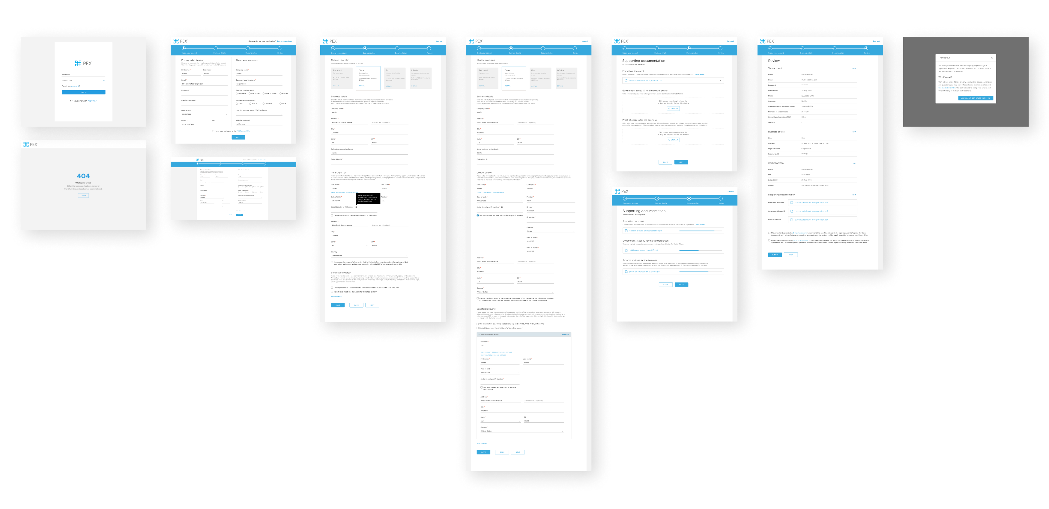
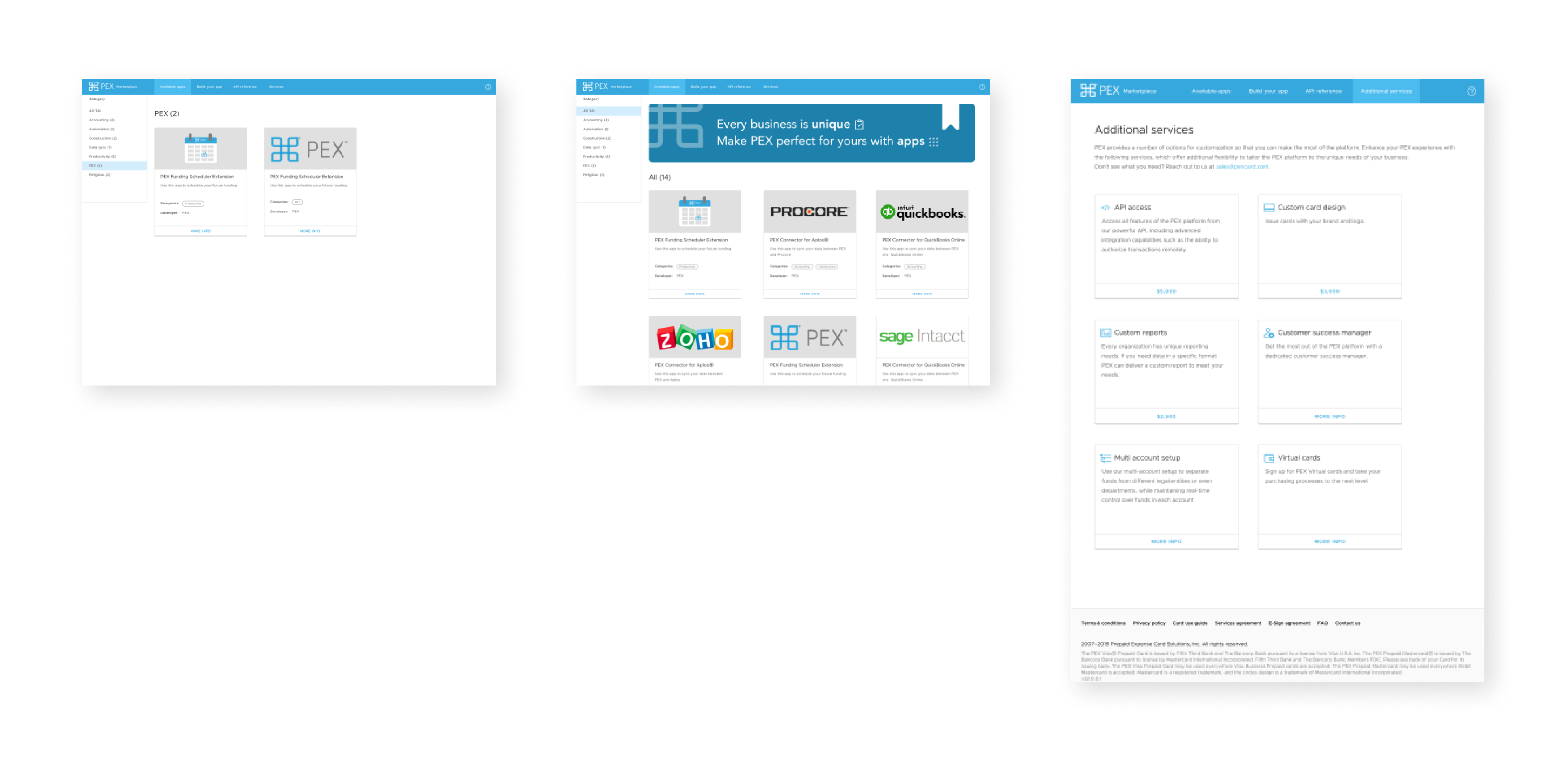
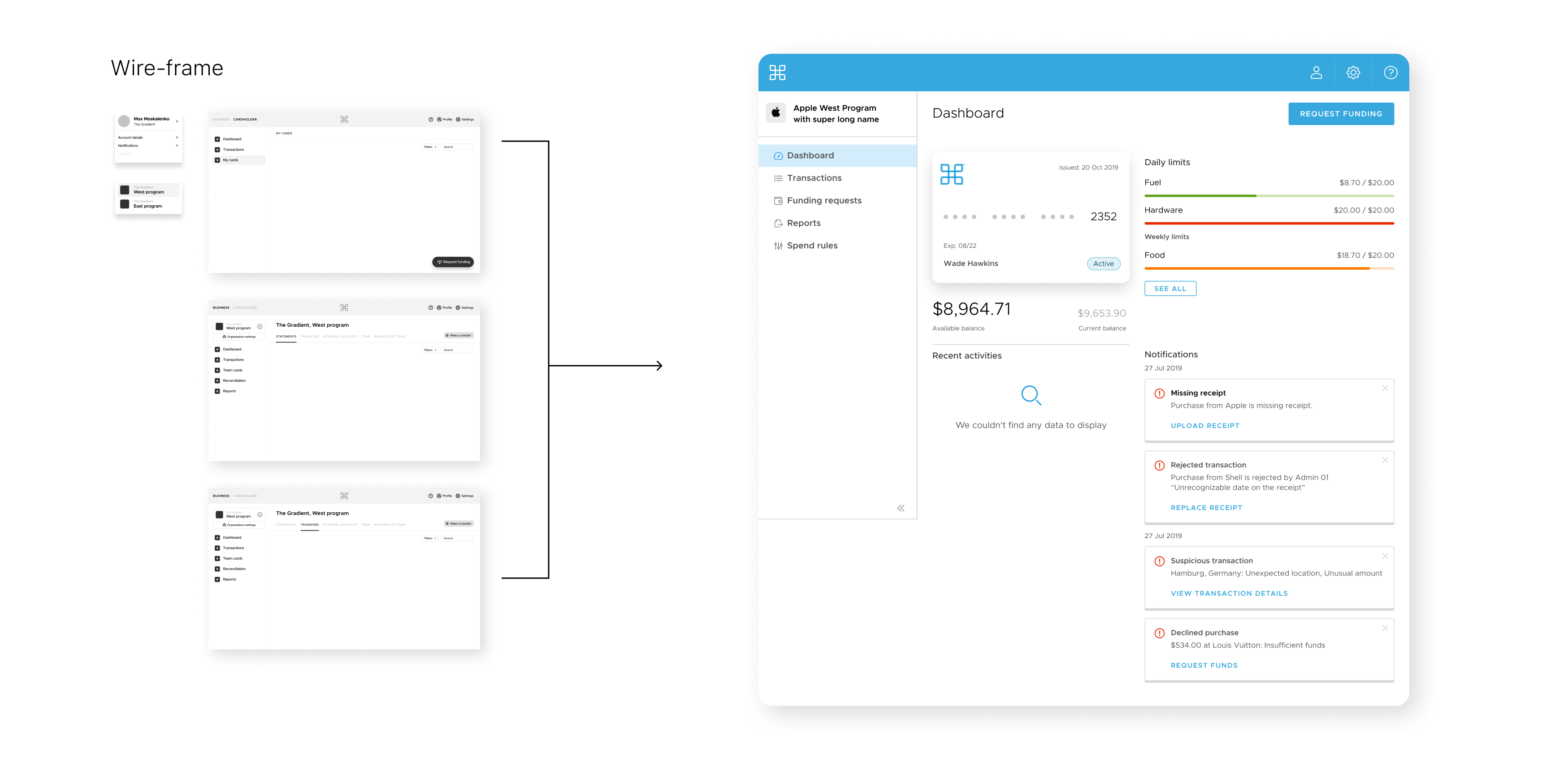
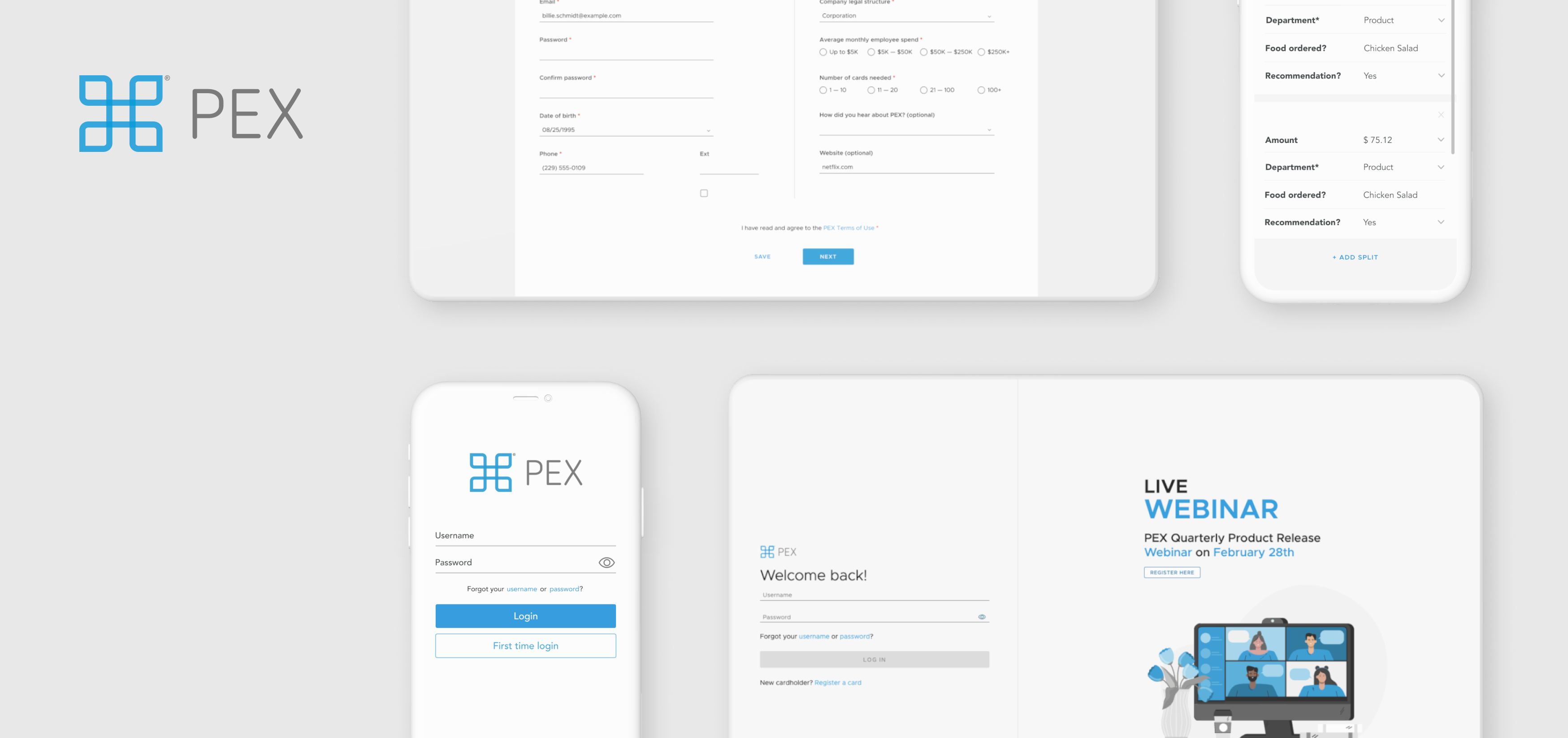
As a UX designer at PEX Card, I was responsible for improving the user experience of PEX's web and mobile applications.
When I joined the team, we were facing challenges with an outdated interface and unorganized information hierarchy. To address these issues, I conducted user research, market analysis, and usability testing with the team to identify the most important features and common pain points.
Based on the insights gathered, we developed low to high-fidelity wireframes and tested them with actual customers to obtain feedback and refine our designs. This iterative approach allowed us to gather invaluable feedback, facilitating the refinement of our designs. As a result, we seamlessly integrated new functionalities such as multiple accounts and team member collaboration, enhancing the overall user experience.
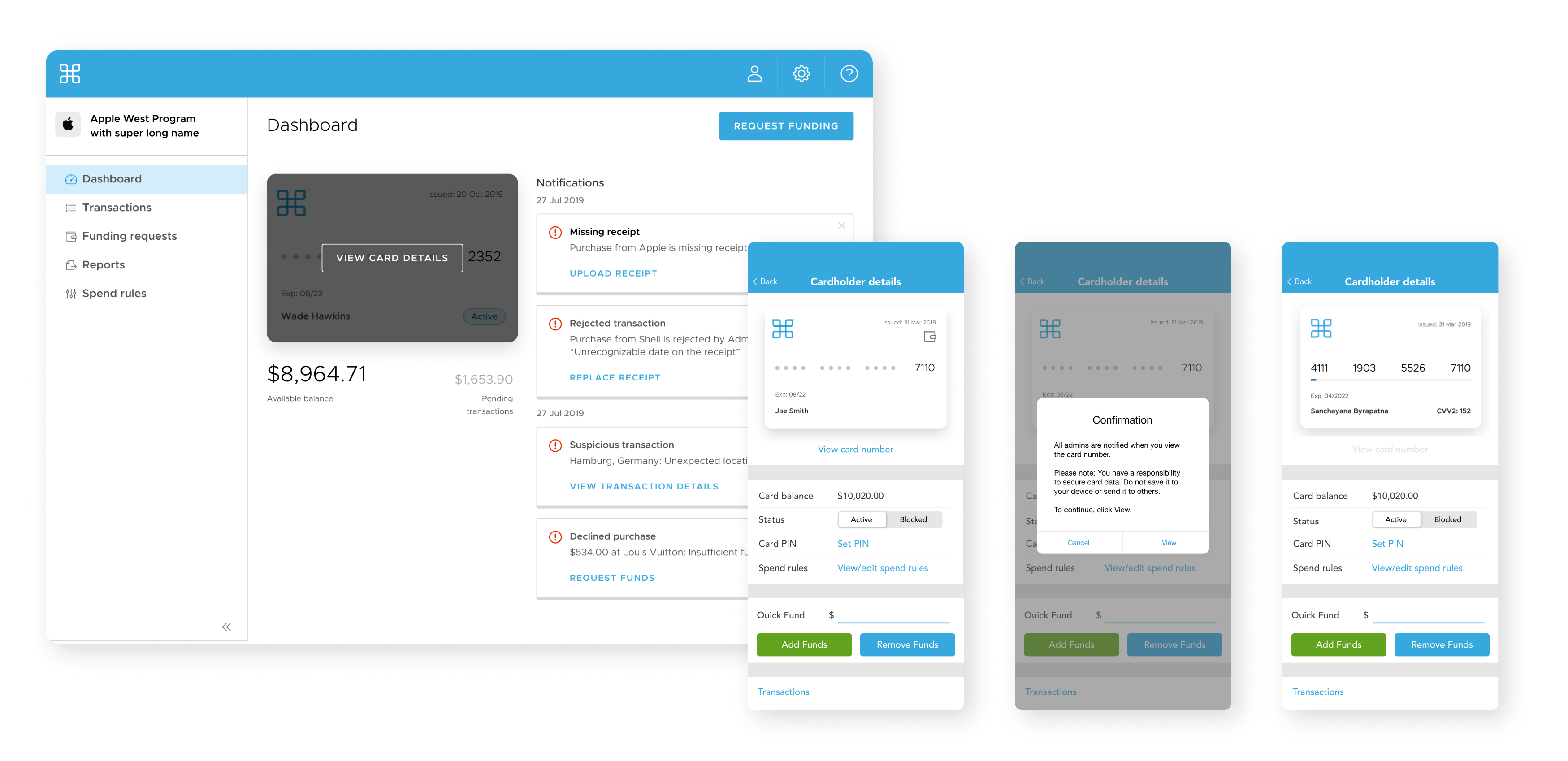
After launching the new portal, I maintained it and collaborated with the Customer Success team to gather feedback and improve existing features or design new ones that addressed customer needs. Introducing 'Virtual Card View' feature within our web and mobile app is one of them. This innovation empowered users to seamlessly access and utilize their corporate credit cards sans the physical card, significantly streamlining their spending management and tracking processes.
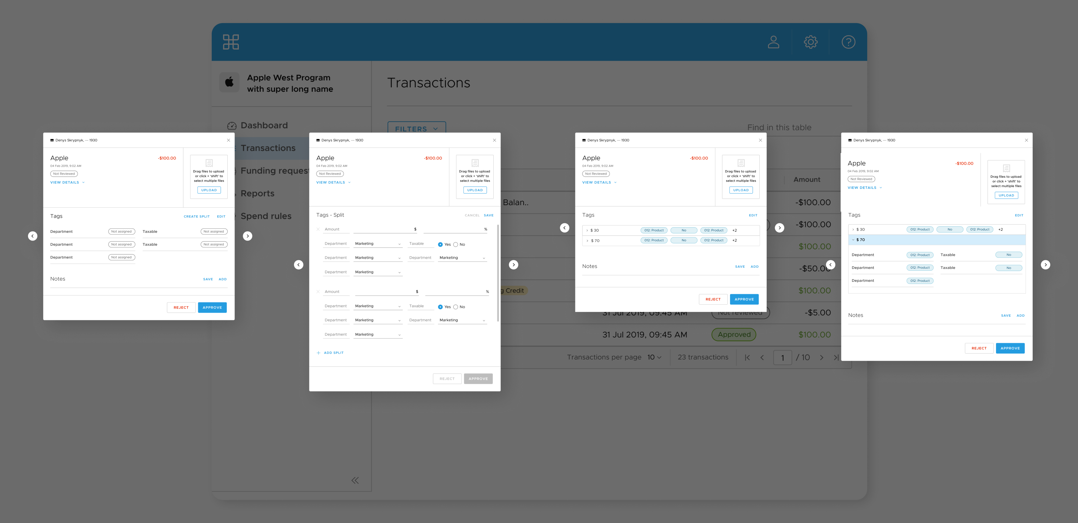
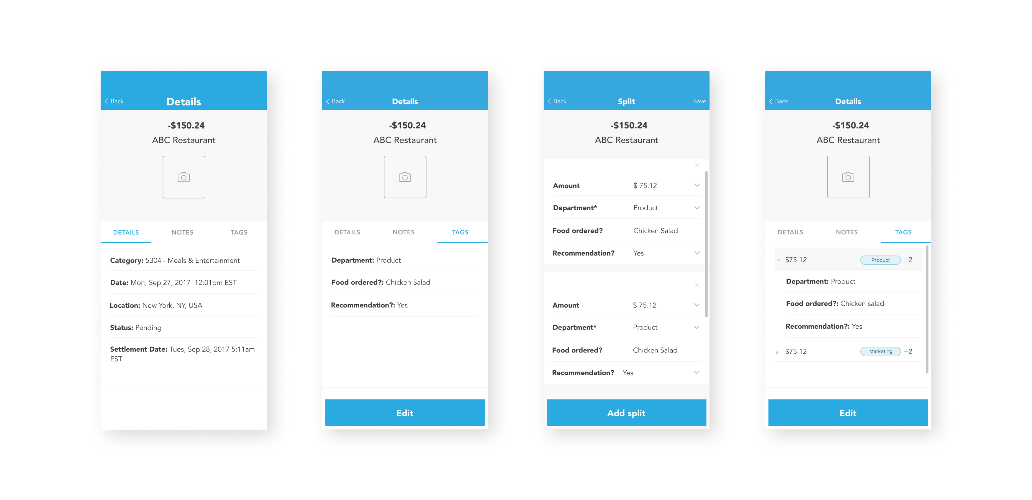
Moreover, I led the development of the 'Split Tags' functionality to address a common pain point among our clients. By enabling users to categorize spending within individual transactions, we provided them with a more accurate and efficient means of managing and reporting their expenses. Both initiatives served as pivotal milestones for PEX, paving the way for the expansion of our business into Grant disbursement. I also revamped the Marketplace Web App to better market PEX integration with different apps and products, using the same design and UX principles from the new portal.
Apart from product design, I also created marketing materials such as social banners, online ads, email campaigns, and customized card designs to promote the benefits of the PEX solution. Overall, my role as a UX designer at PEX Card was to enhance the user experience and promote the product effectively through thoughtful design and user-centric approach.
Live Sites (to public): Apply Site, Marketplace
Split Tags

NI Digital Experience
Role: Designer
Skills: UX Design, Design System, UX/UI QA, Prototyping
Collaborated with
Lara Horowitz
Joanna Skora
Krishna Fitzpatrick
NI(formerly National Instruments Corporation)—the leader in developing automated test and measurement systems that help engineers solve the world’s toughest challenges—was my first client that I worked with in a team of designers, strategists, and project managers at Organic.
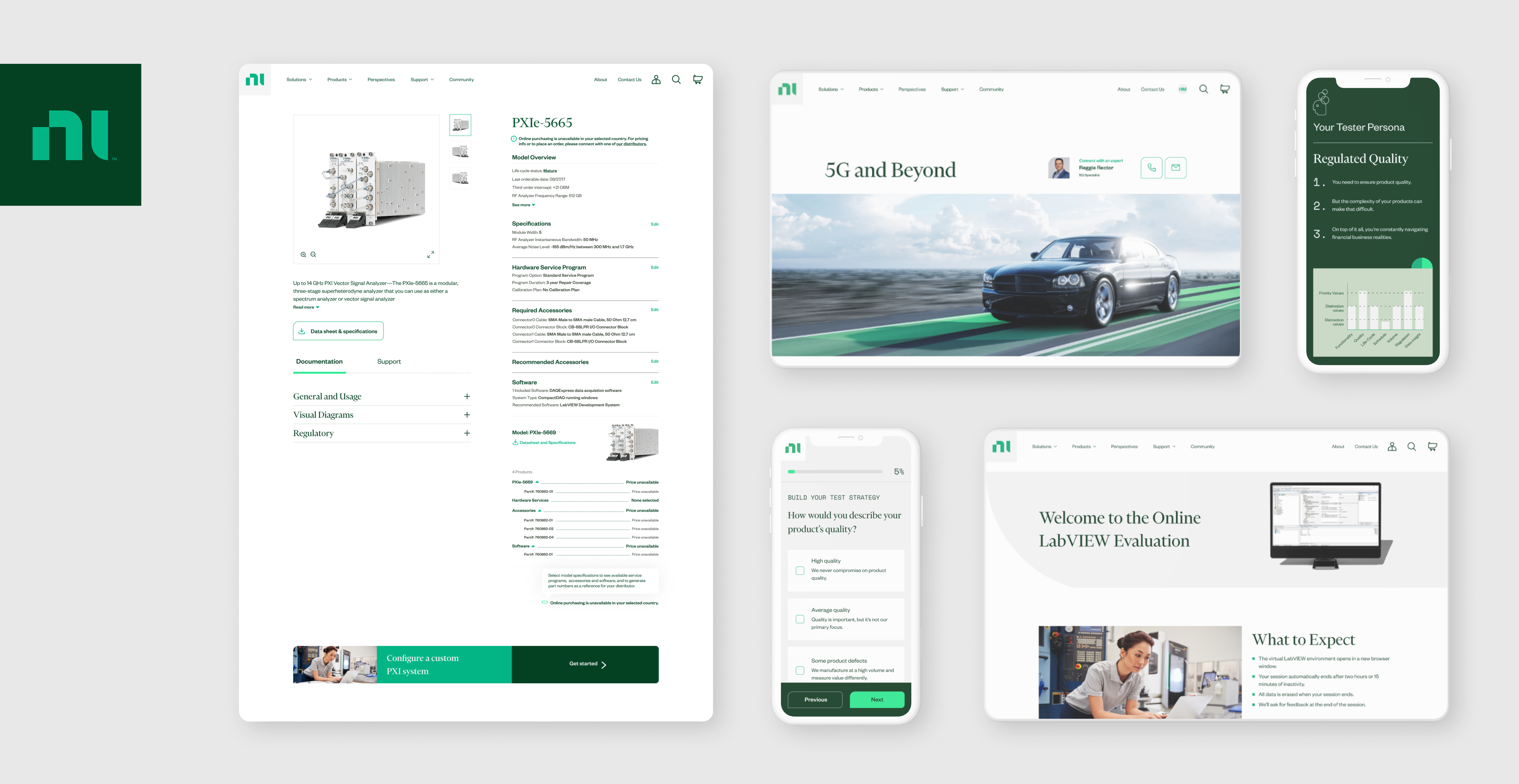
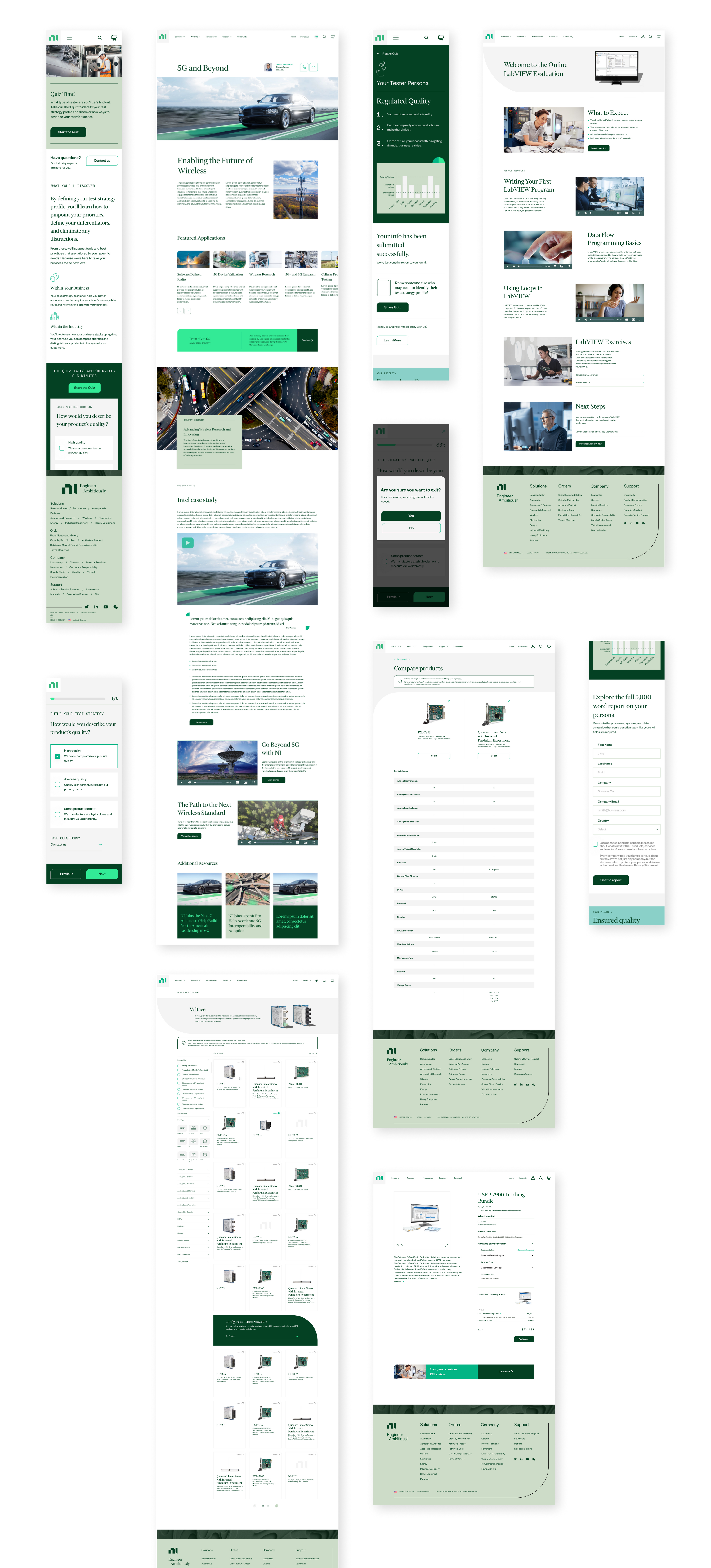
National Instruments rebranded their business to bring in a modern image to the company and to create a visual style that reflects their core value. Our team was in charge of adapting NI’s new brand into their digital experience. A crucial part of the digital application was the revamp of NI's online shopping experience. The company transformed its product catalog into a efficient shopping platform, supported by a custom navigation system that allowed customers to easily filter and refine their search results.
As a designer in the team, I worked closely with a creative director, senior designers, and developers during the process. Updating and organizing the component library, designing page layout, creating new component, and QAing the deliverables during the development were my main responsibilities.
Here is the collection of the screens that I participated. You can also check these out on the live website.

Palo Alto Networks Digital Experience
Role: Designer
Skills: UX Design, Design System, Content Audit, Prototyping
Collaborated with
Jay Roeder
Krishna Fitzpatrick
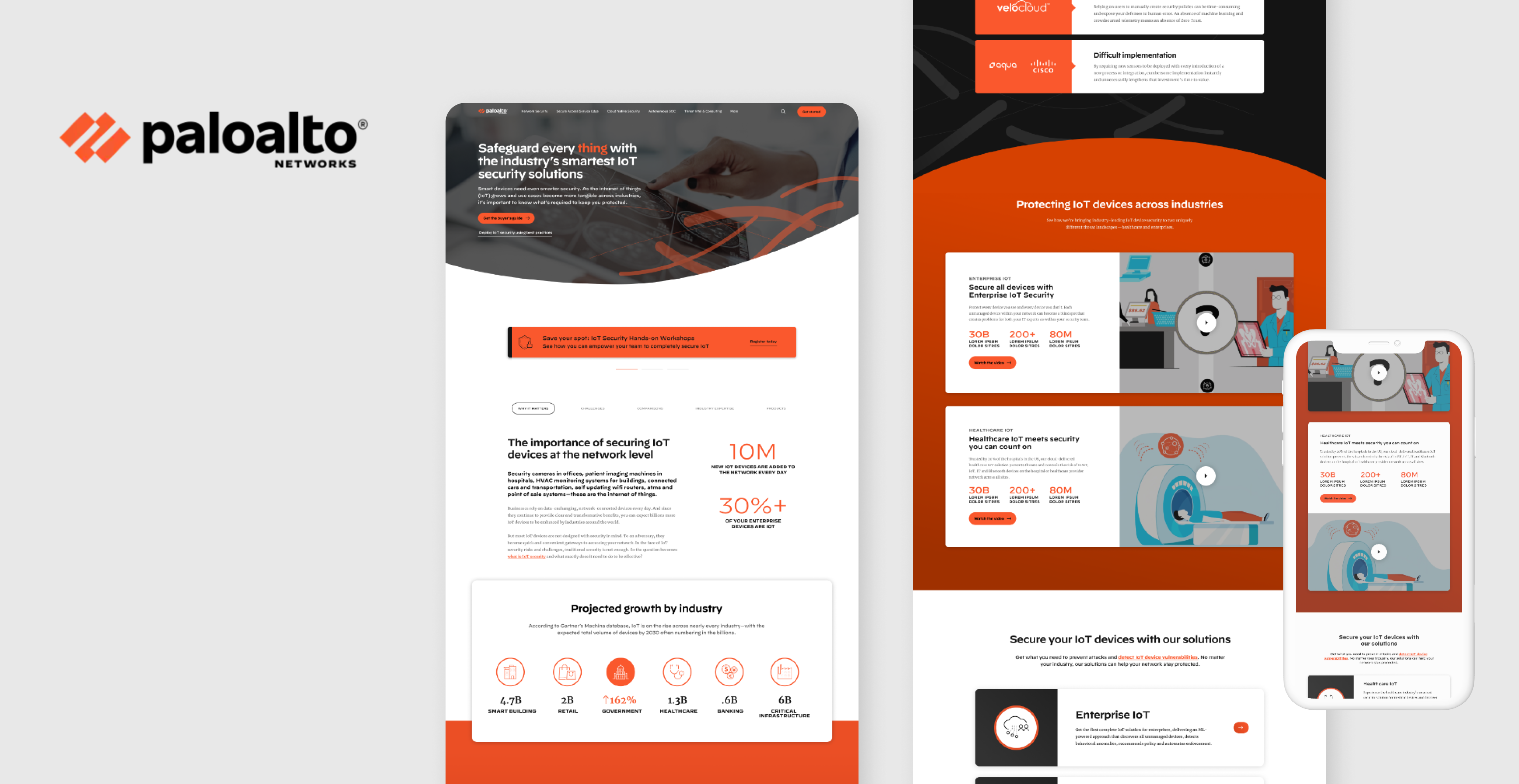
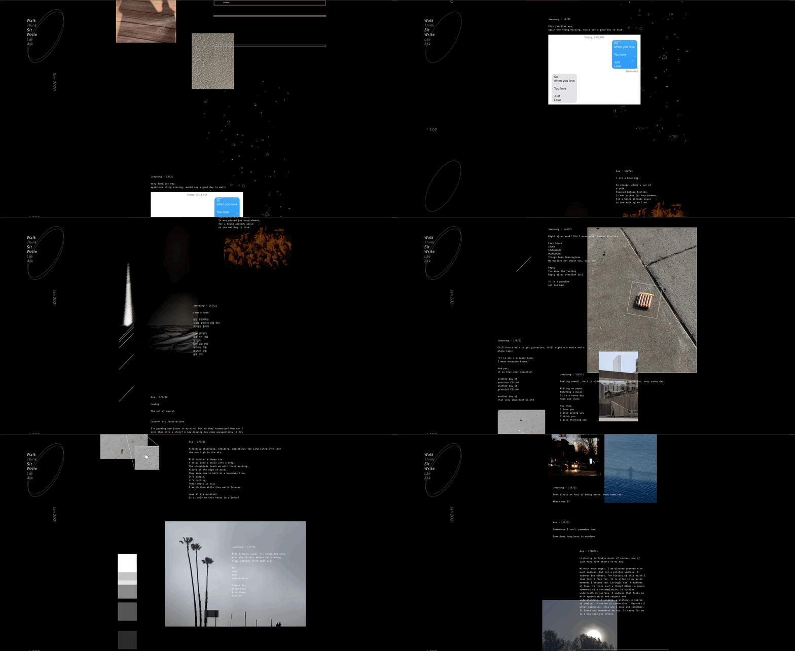
At Organic, I worked with Palo Alto Networks(PAN)—the global cybersecurity leader, that continually delivers innovation to enable secure digital transformation—in a team of designers, strategists, and project managers. PAN’s immersive digital experience with numerous branches of products and solutions allowed us to explore distinctive and cohesive visual language and system. I worked closely with senior designers, strategists, and delivery manager during the process. I, as a designer, supported developing a component library for PAN’s web, tablet, and mobile experiences and created graphics, new components, page layouts, and prototype of flexible navigations.
Here is the collection of the screens that I participated. You can also check these out on the live website.

Walk Sit Write - Web Journal
Role: Writer, Editor, Designer, Photographer
Skills: Writing, Editorial Design, Photo Editing, Readymag
Collaborated with
Ava Kvapil
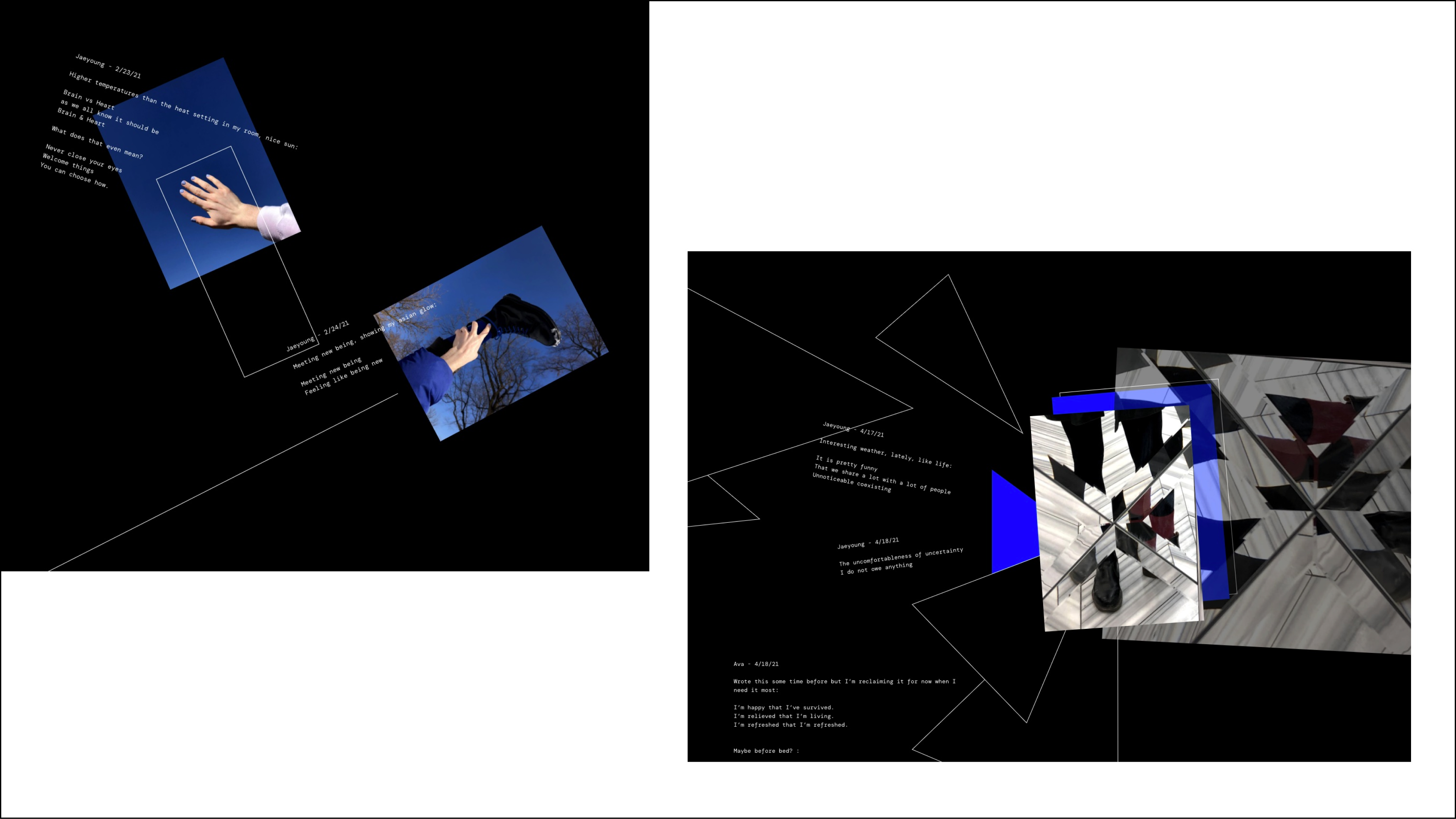
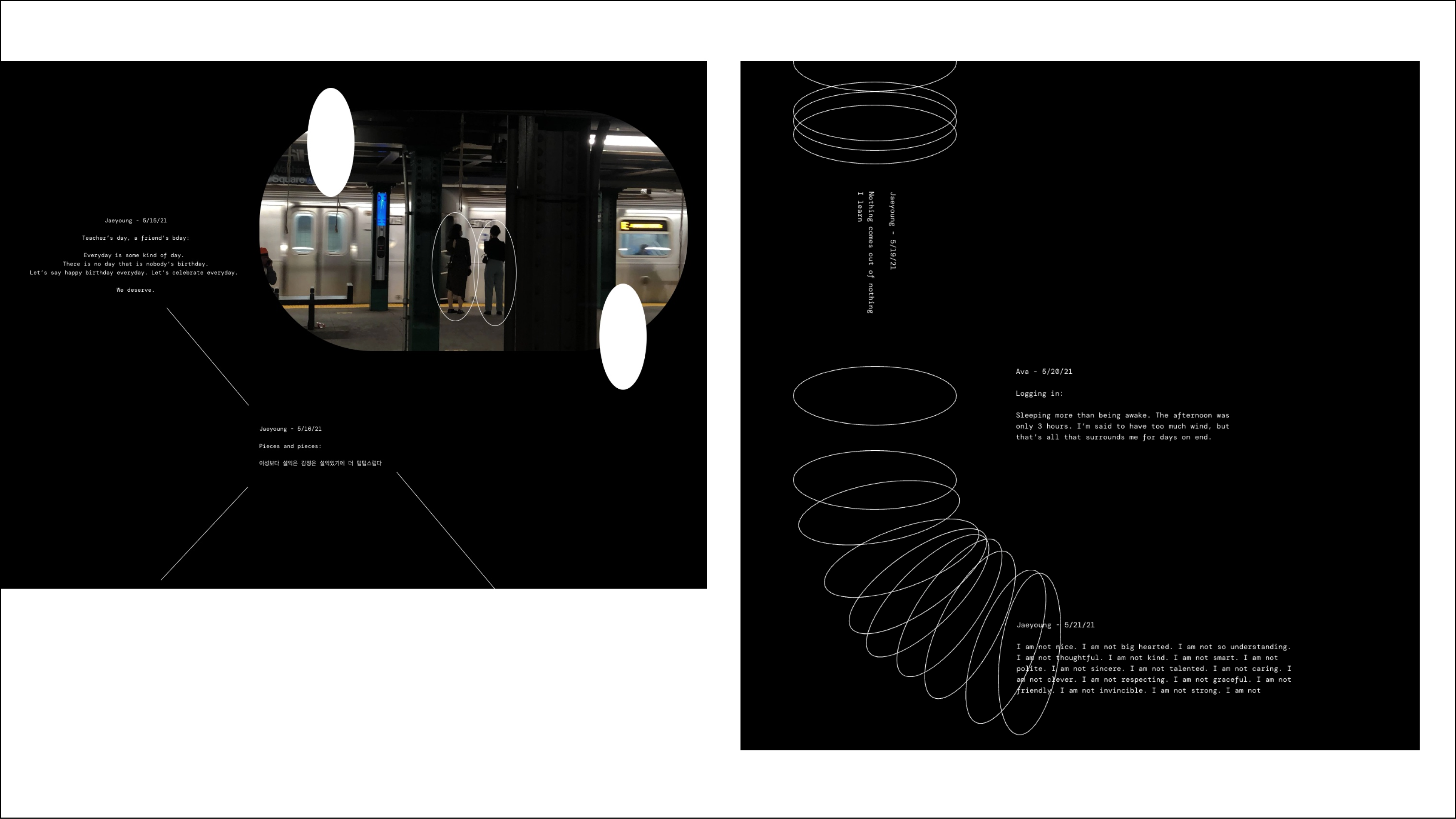
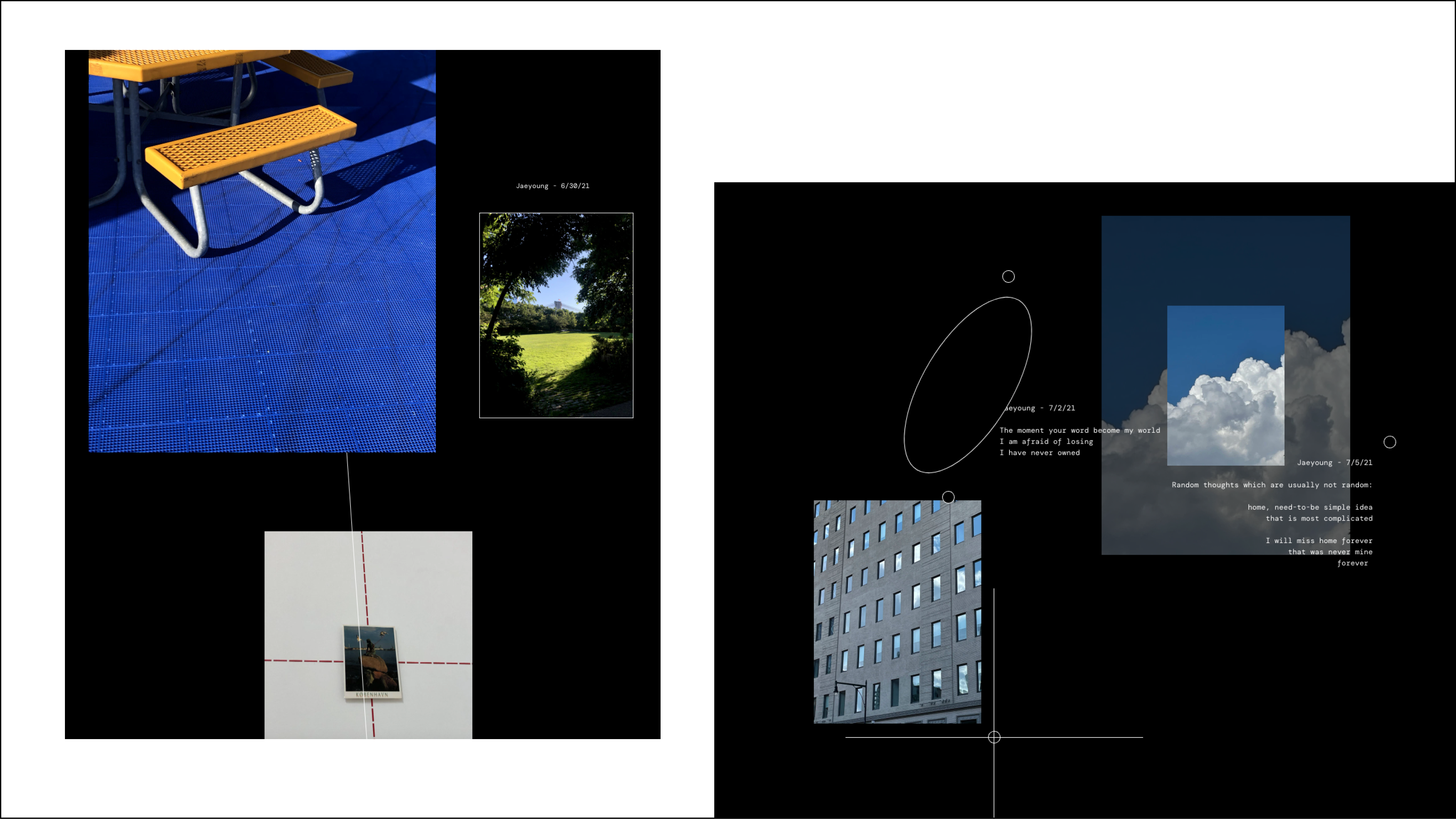
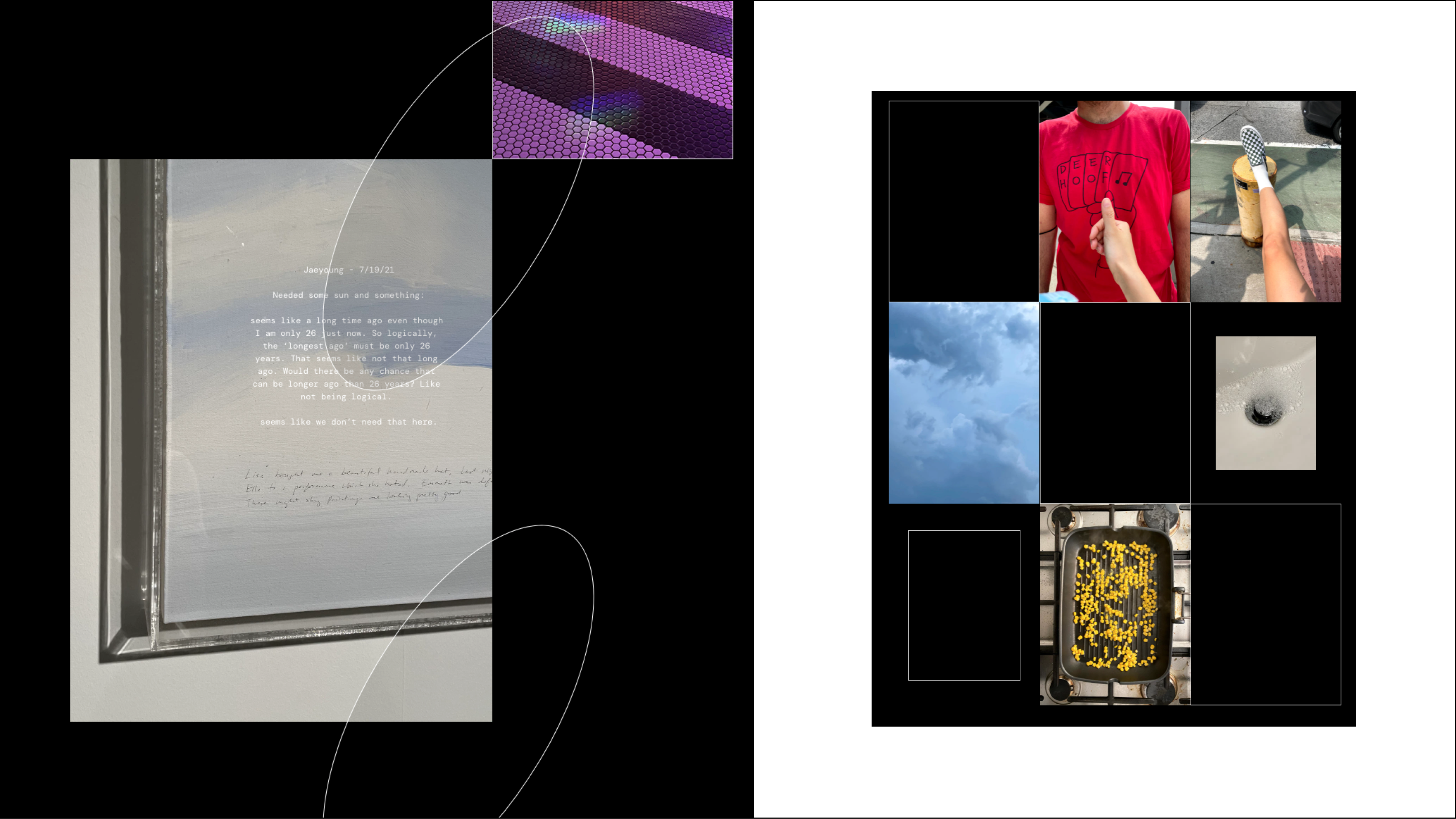
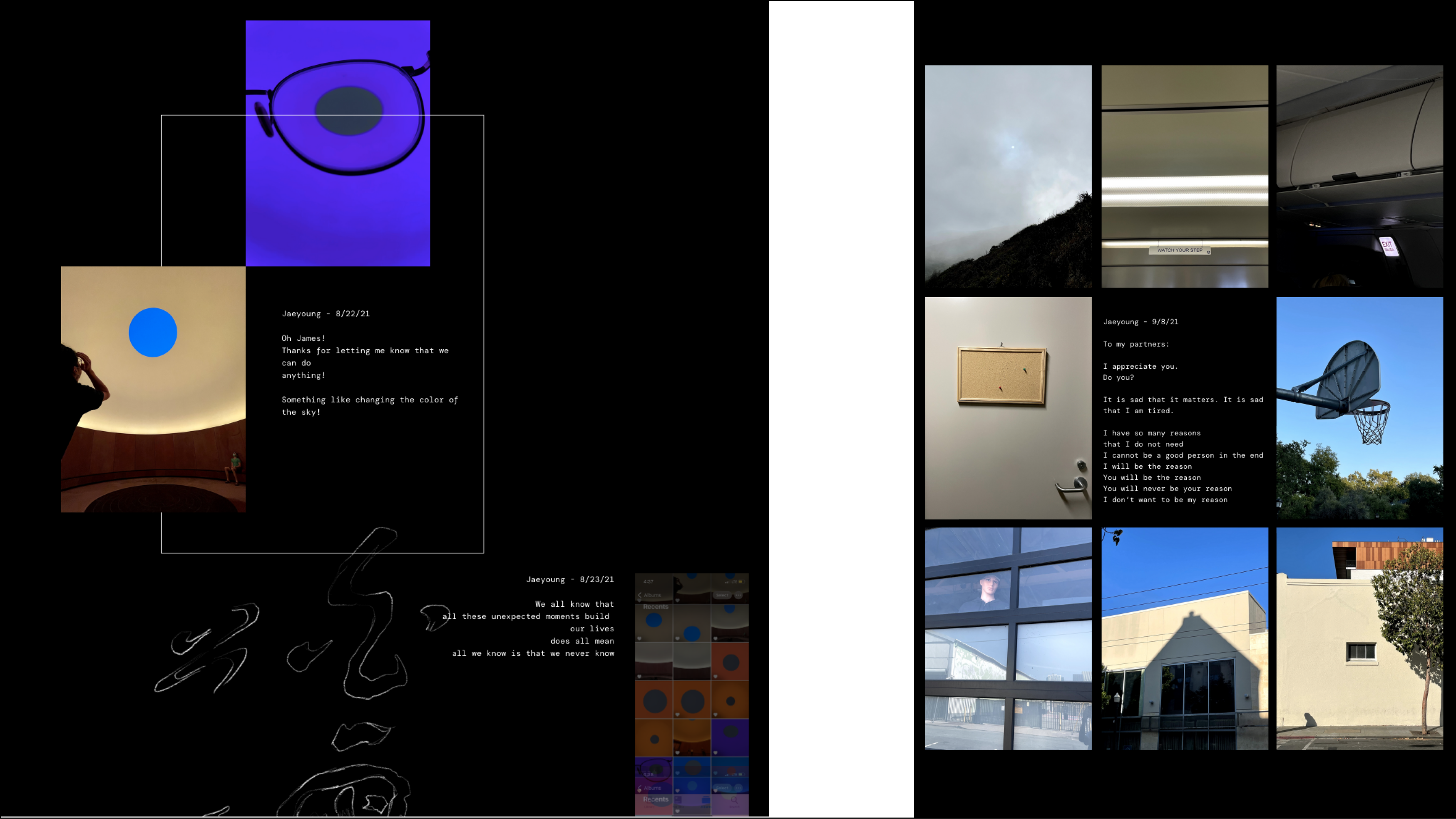
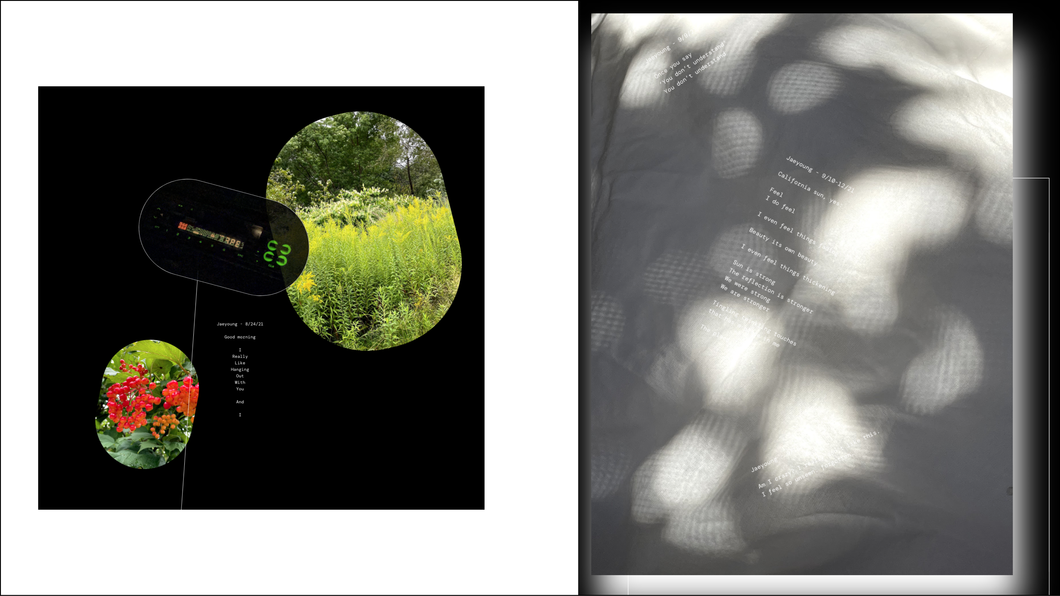
"Walk Think Sit Write Lay Ask" is a collaborative web-based photo journal born out of a shared love for walking and documenting personal reflections. Created by me and my best friend Ava, who lives on the other side of the country, this project was a challenge and an experiment. We wanted to create a space to share our thoughts and experiences despite our distance, and also make it accessible and inspiring for others.
Our journal is a personal and interpersonal documentation of the moments we capture during our walks. Although the content is very personal, we wanted to make it an open space for others to find inspiration. The activities in the title of our journal — walking, thinking, sitting, writing, laying, and asking — are used as prompts for reflection and creative expression. This project has lasted almost a year and we are very proud of it. We hope it will encourage others to explore their own experiences through the lens of these different activities. There will be more fun projects by us, so stay tuned!
Here is the link to the live website. Desktop version is recommended.
Some of My Favorite Moments

<Goodies>
Role: Designer
Skills: You tell me ( ͡~ ͜ʖ ͡°)
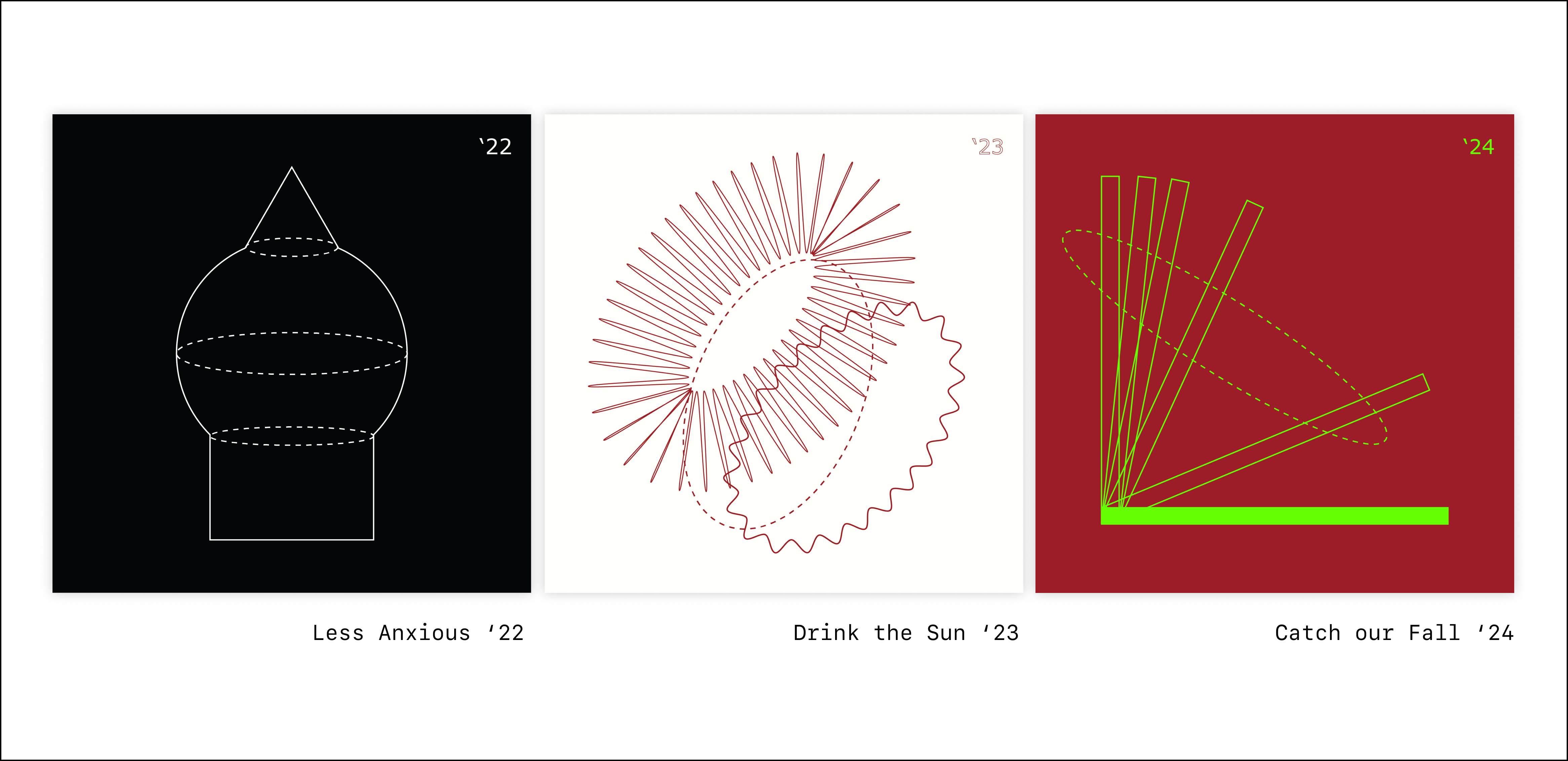
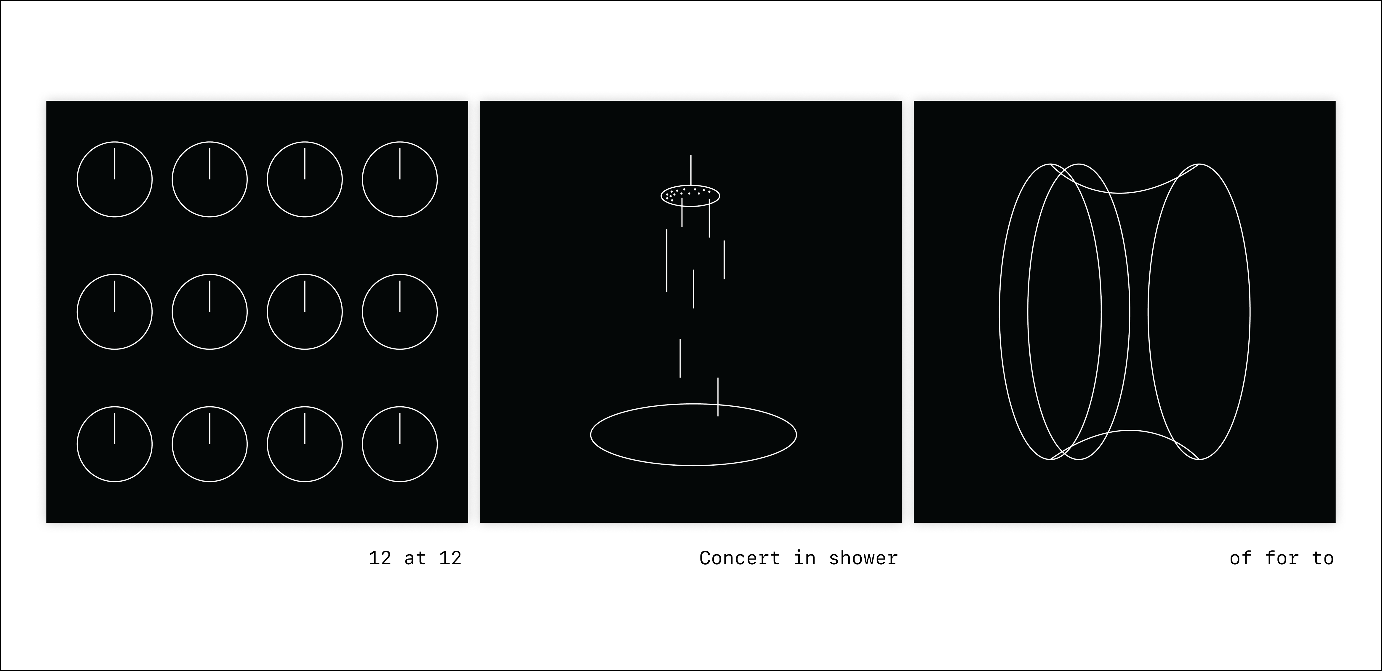
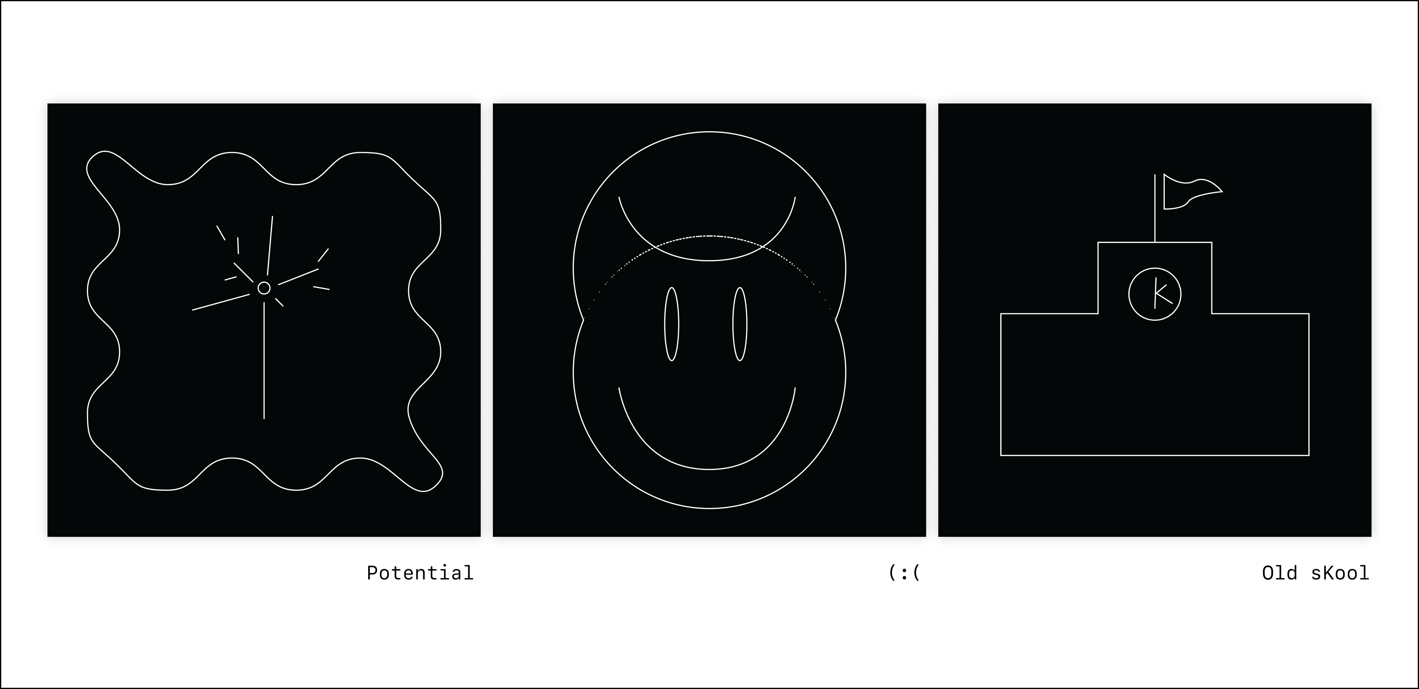
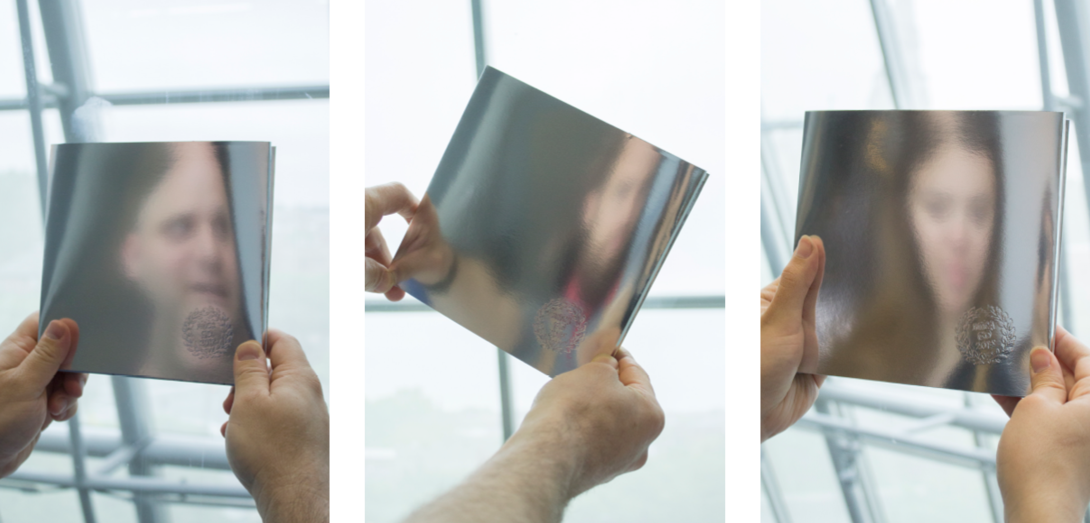
In this section, I'd like to share some of my older projects and creations I've made for fun. While some of them may be older than the ones mentioned above and others are not live projects, they still hold significant meaning to me. I would be delighted if you could take a moment to appreciate them as well.
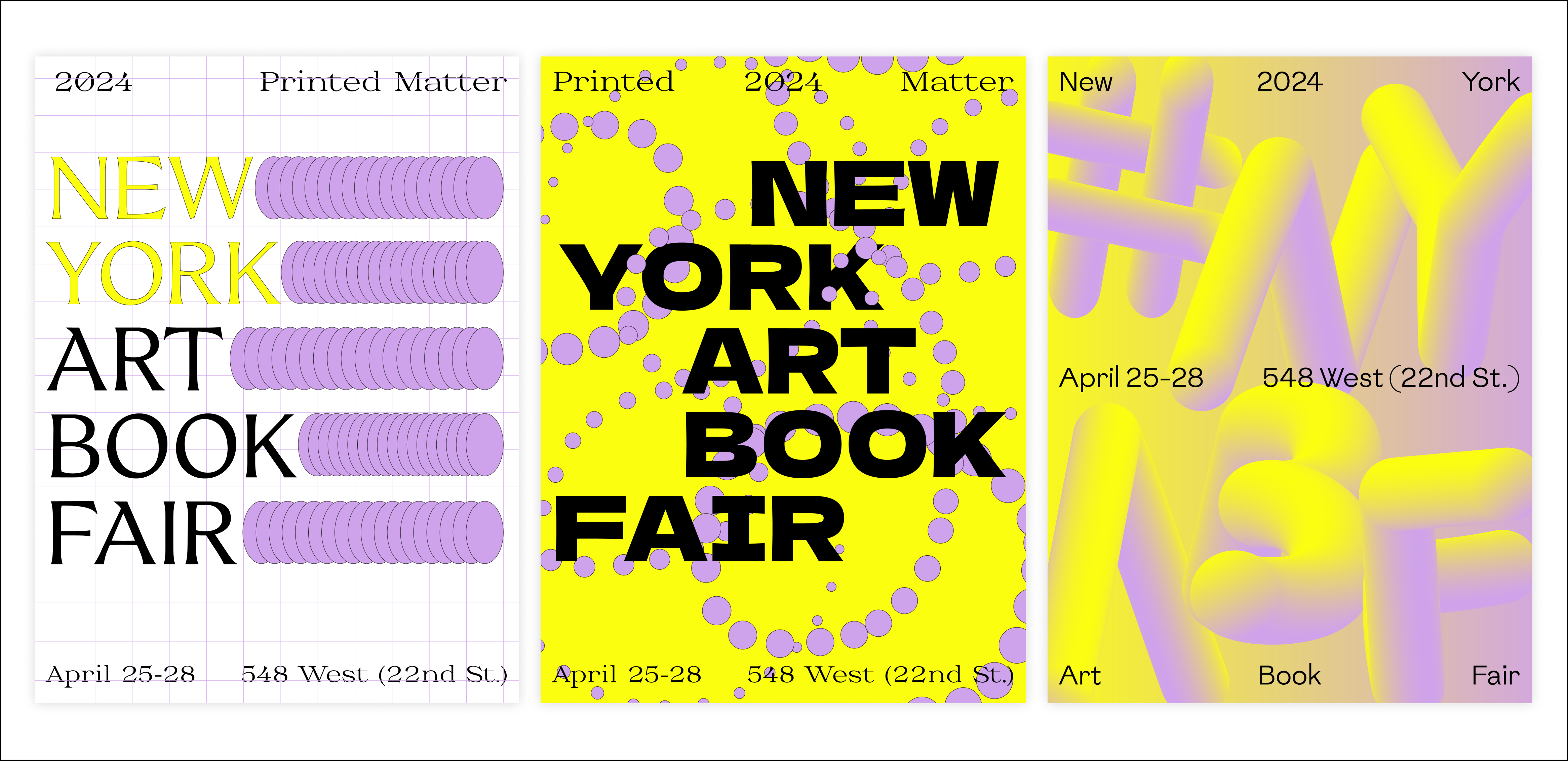
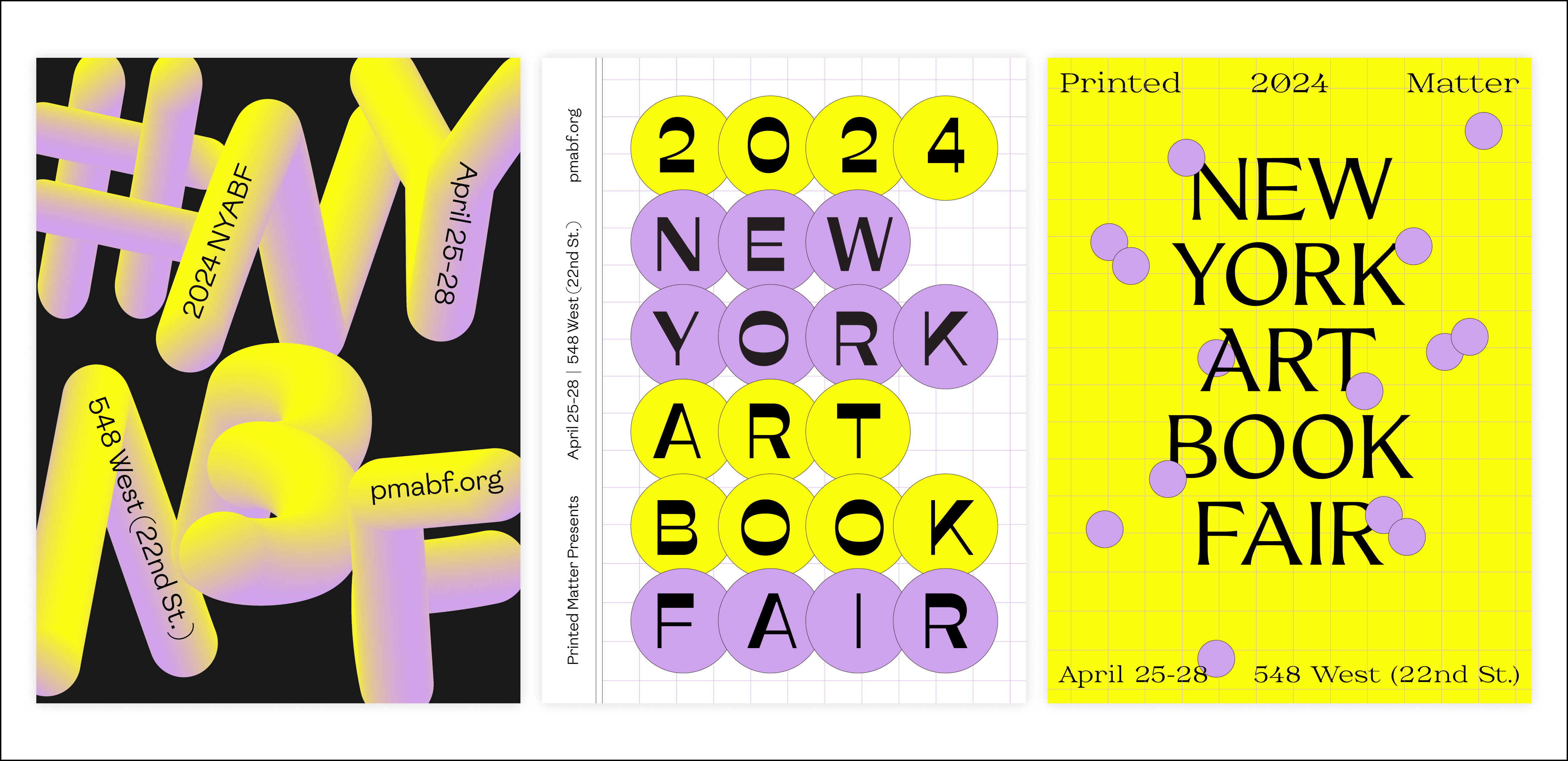
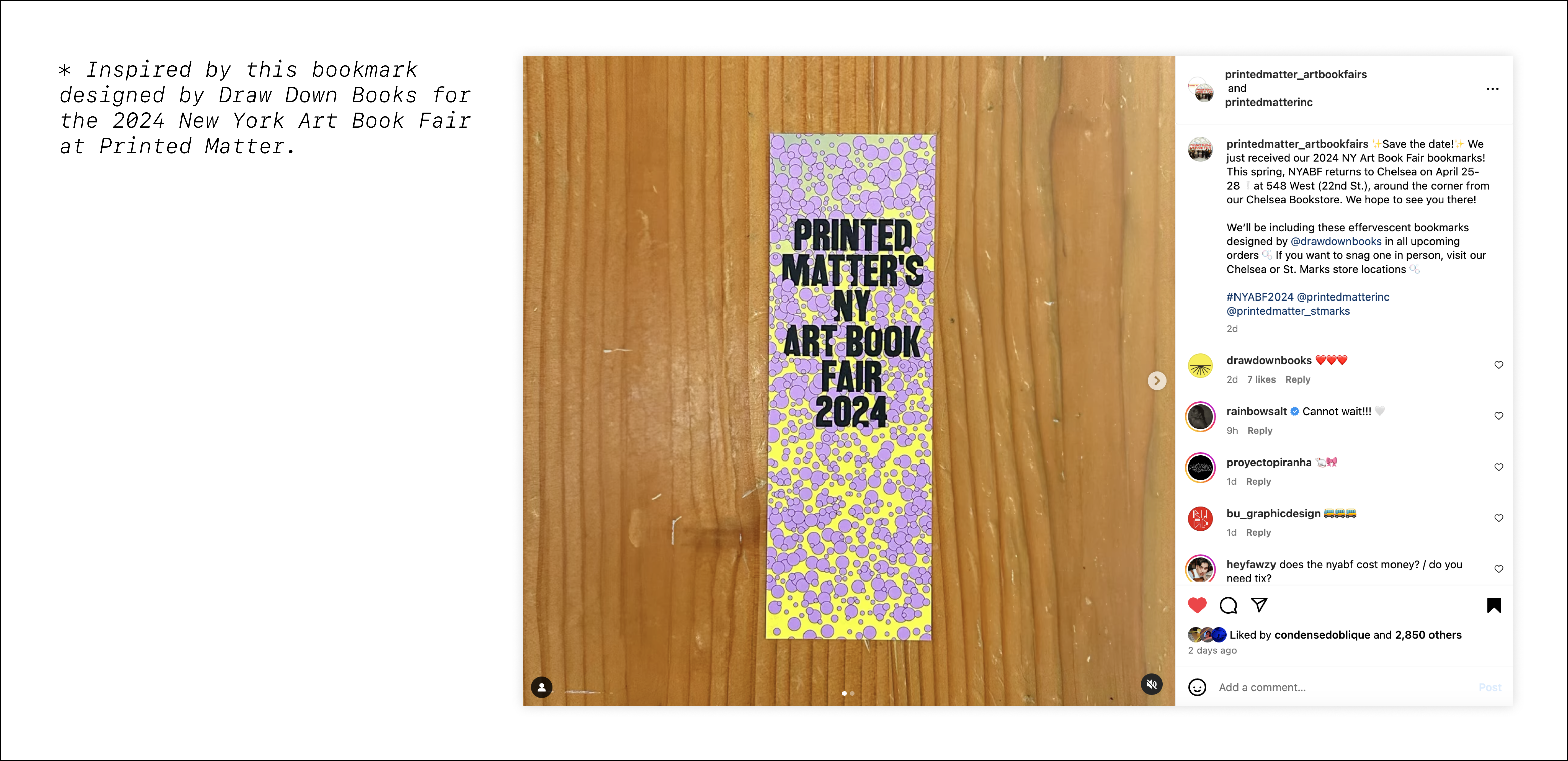
[2024] NYABF Poster (not official, personal work)
[2020-Ongoing] Playlist Covers - Illustration
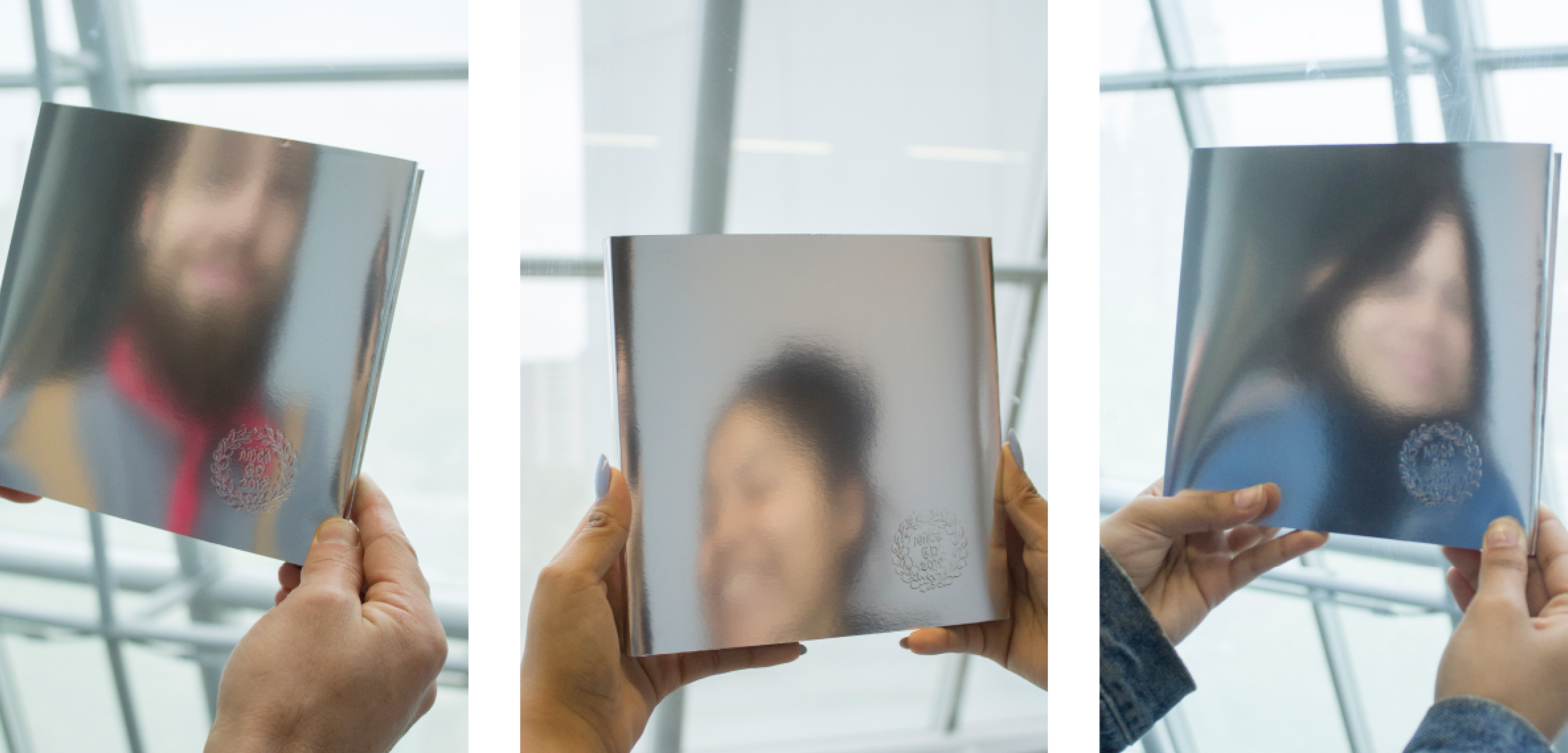
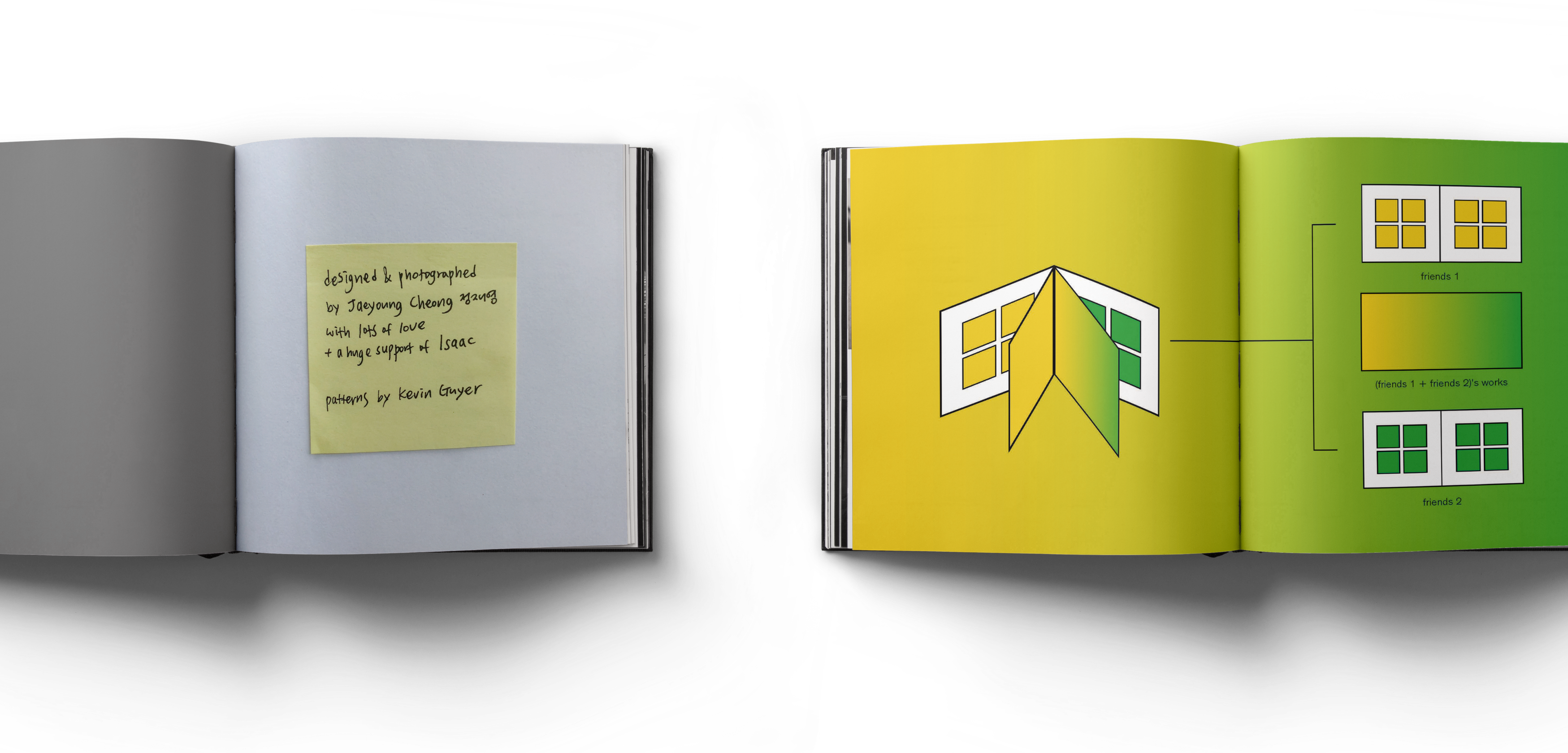
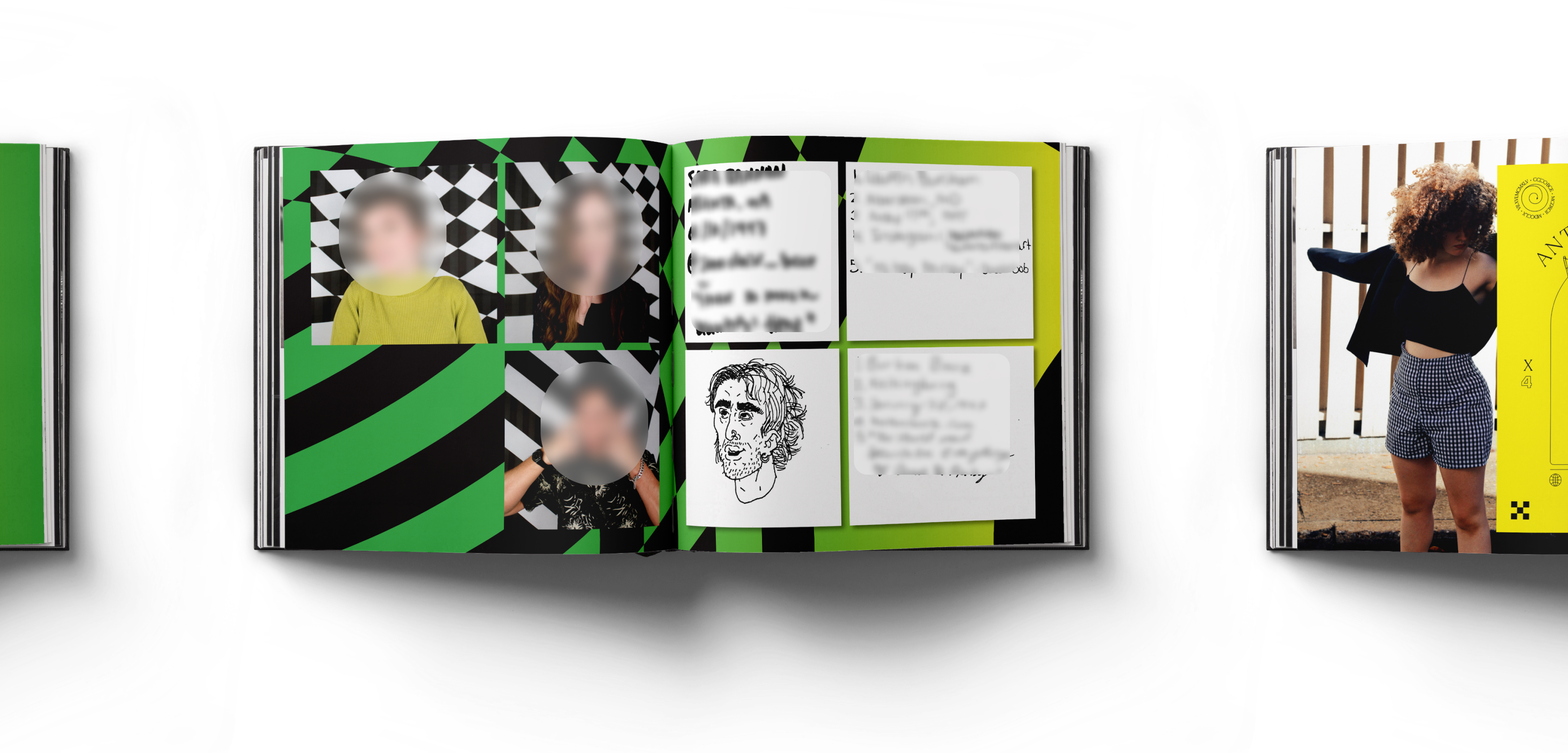
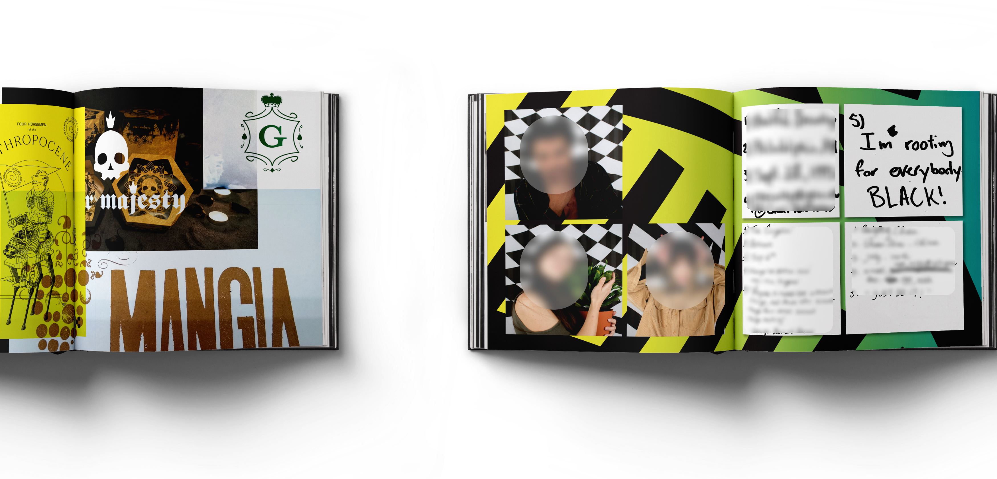
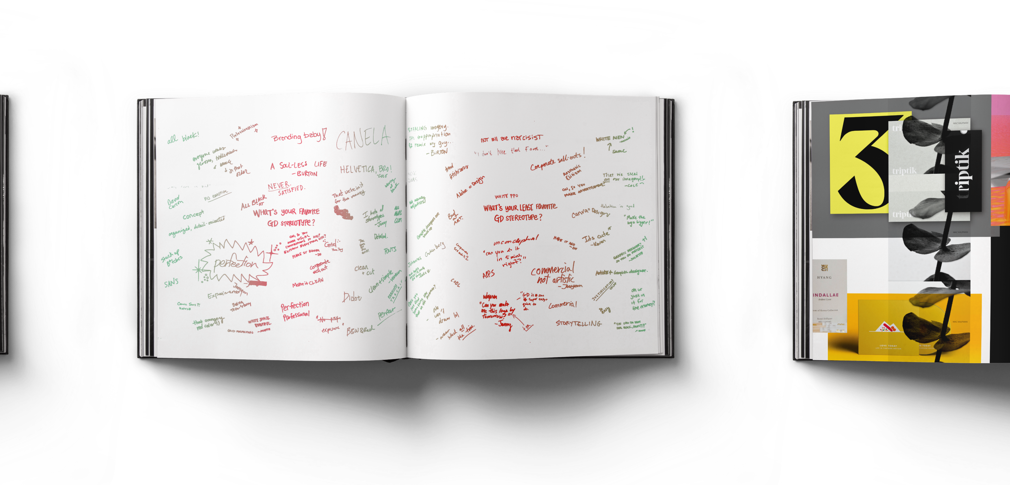
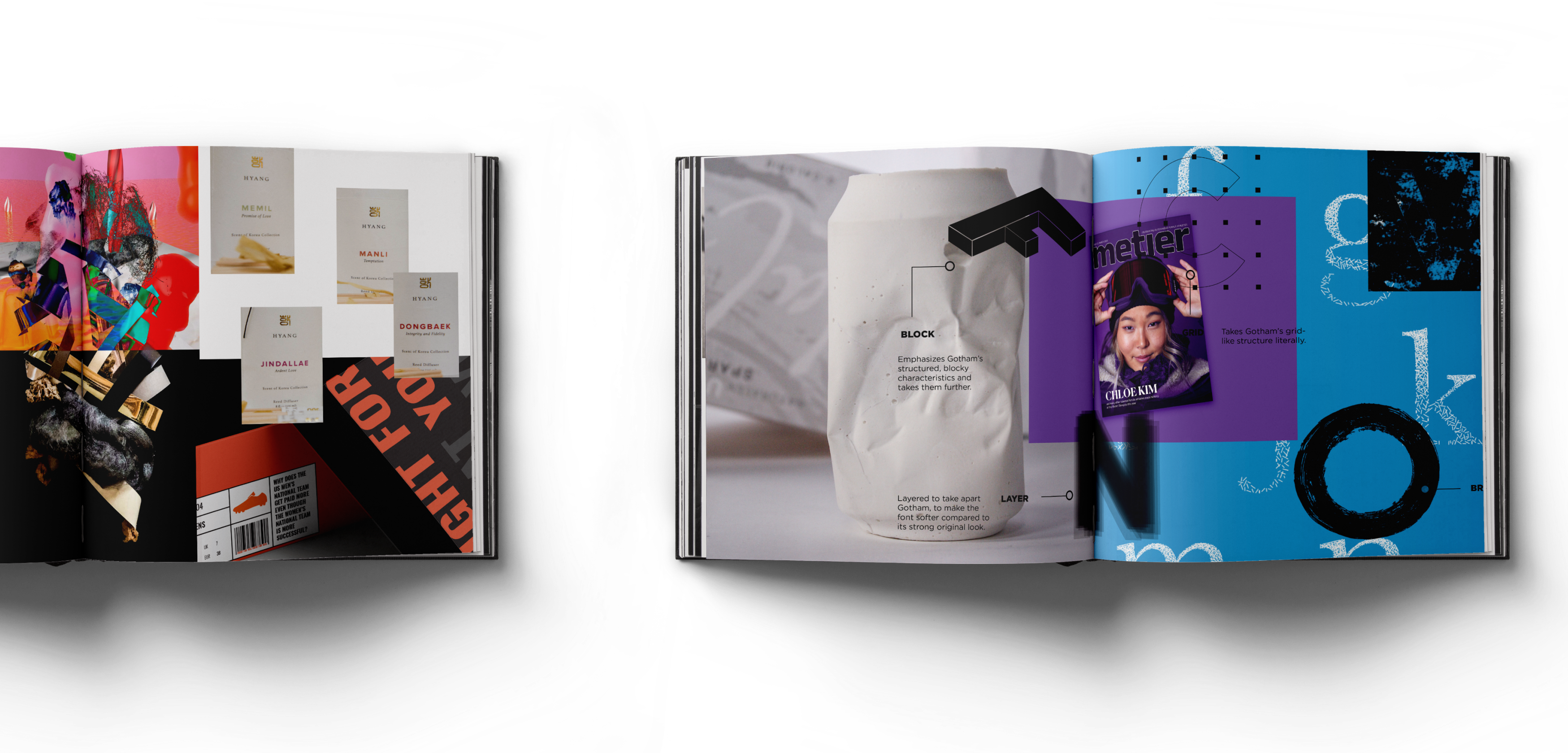
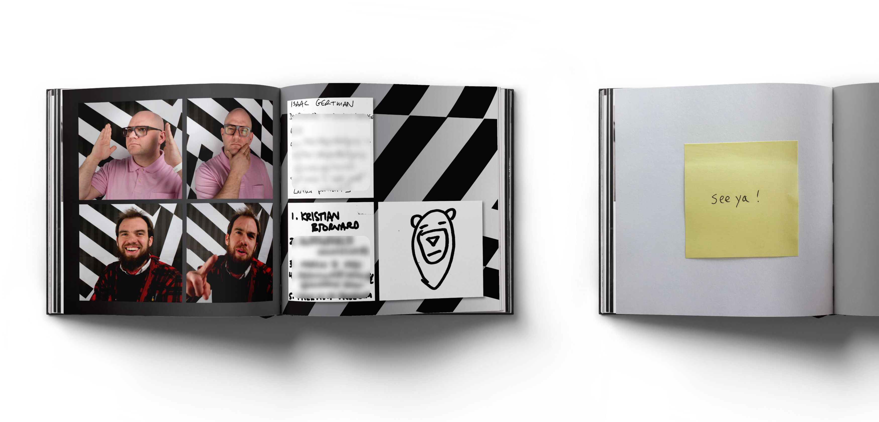
[2019] MICA Graphic Design 2019 Yearbook - Editorial
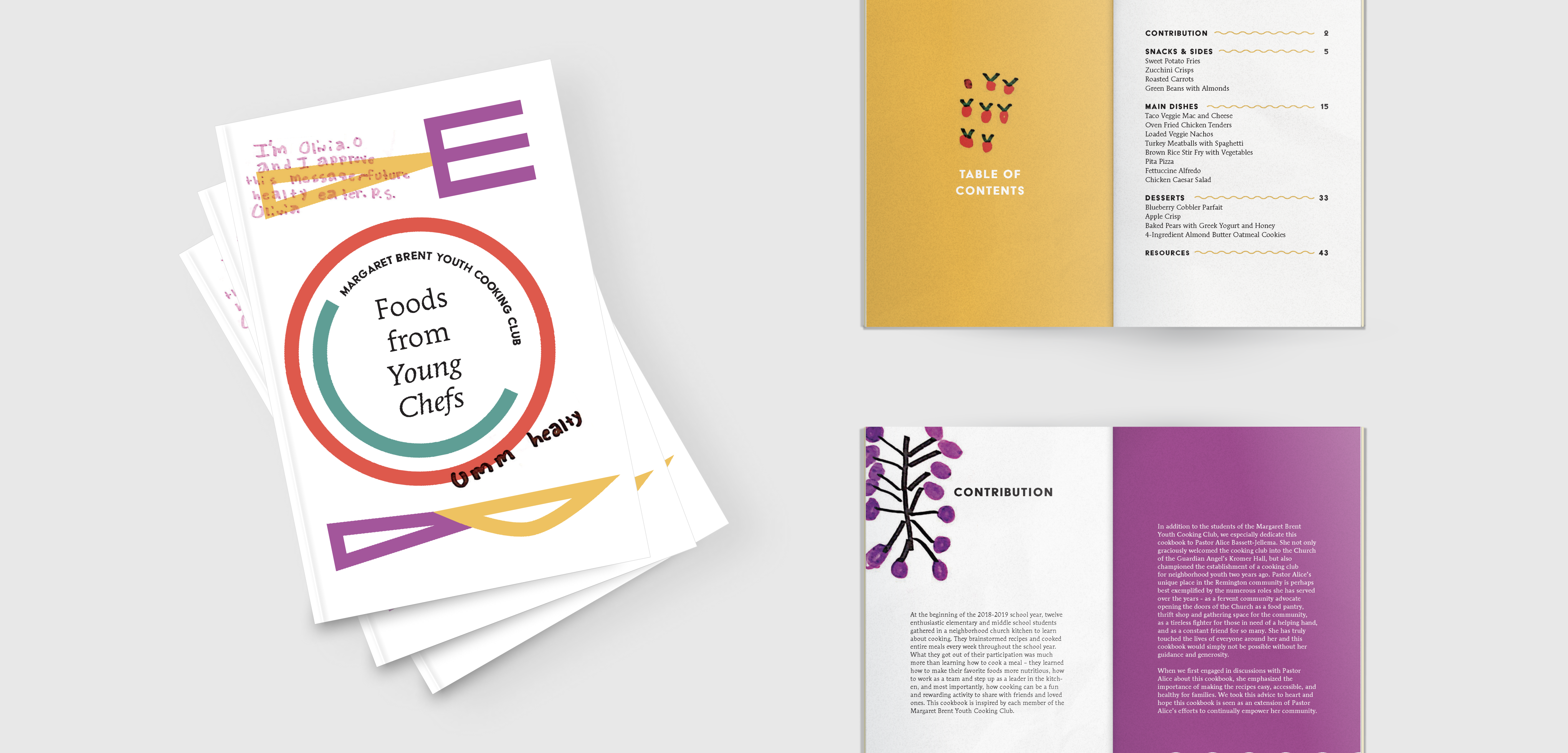
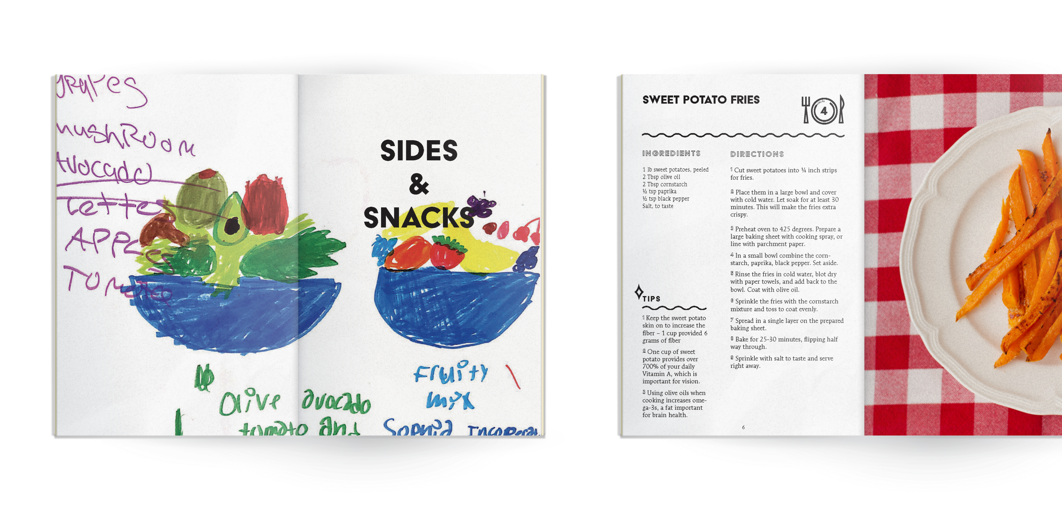
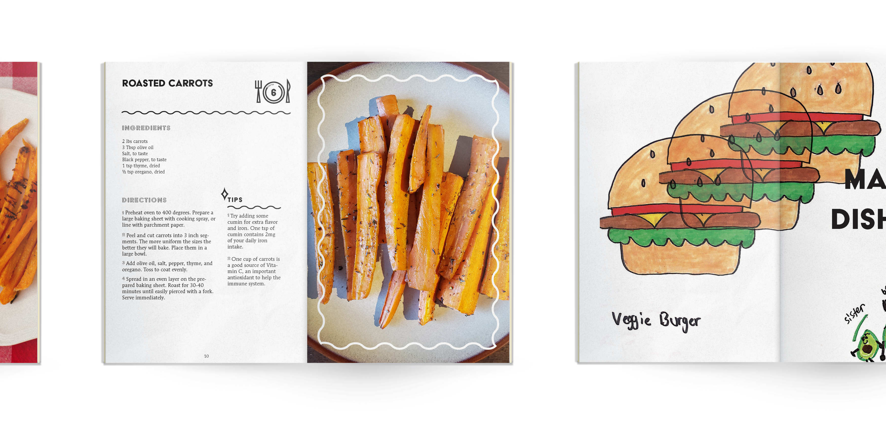
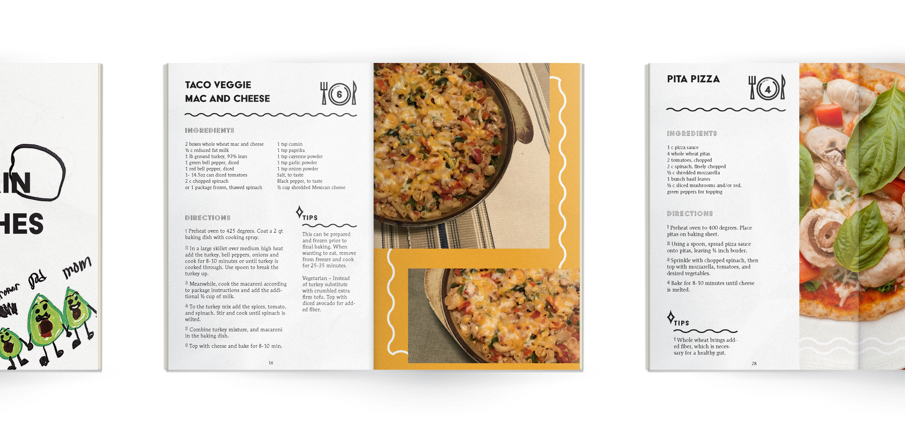
[2019] Food from Young Chefs - Editorial
